Smart Census Enrollment
(Re)designing a smarter census enrollment upload experience to improve data accuracy and integrity, resulting in a first-pass 88% satisfaction rate.
5 weeks
UX design
UI design
Interaction design
Figma
FigJam
Pen & paper
Census files hold a lot of employee-related data. Uploading and working on them has historically been a pain point for internal (Beam employees working in the Admin system) and external demographics (using Lighthouse or connecting with Beam's support teams). Non-standard file format uploads, contextual information that may be correct but technically is a mismatch (think SSNs with vs without dashes), and needing to connect with help can result in a minutes-long process taking hours or even days to troubleshoot. Also, as part of Beam's partnership with The Hartford Insurance Group, our systems would be integrating and communicating to fulfill census-related needs or requirements. To that end, we asked:
Video by ArtHouse Studio from Pexels
Also, as part of Beam's partnership with The Hartford Insurance Group, our systems would be integrating and communicating to fulfill census-related needs or requirements. To that end, we asked ourselves:
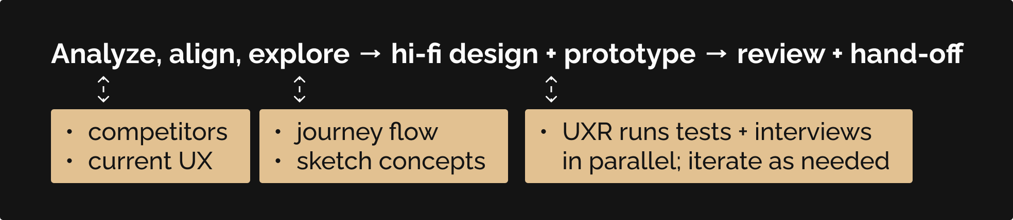
There were already some good directions I could run from: some competitors, Beam's current Admin census enrollment experience, and Beam's quoting tool's census enrollment UX. Using these as a foundation, I made sure to align with the Product team on my proposed direction, then relied on our Research team to weave usability tests into their ongoing interviews with brokers and HR admins while I fleshed out the prototype.
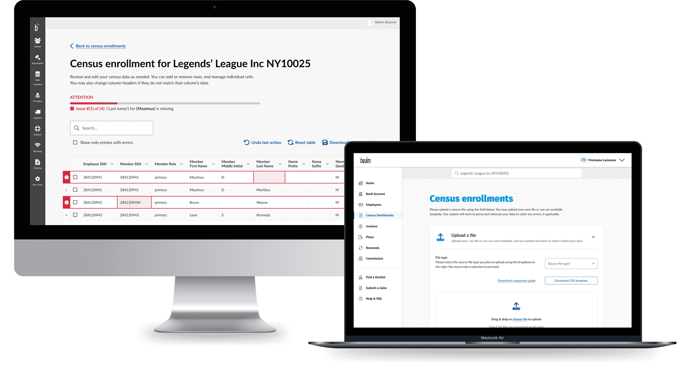
This new census enrollment experience for the Admin system would address the need for accommodating multiple census upload scenarios, while modernizing the UI to match the backend work being done to enable 'smart-matching' parsing capabilities.
the UX Research team tested designs using a System Usability Scale (SUS), and found that the prototype fell within the 'acceptable' range (B+, an average score of 88). Users can, through this new experience:
Beam's current internal census upload experience was in great need of an overhaul, and the UX Research team was already speaking with insurance broker and HR admins about their experiences. The overall process felt disjointed, prone to errors along the way.
of interviewees wanted more control over the census upload process
This wasn't surprising, when considering the current state of this experience: corresponding with Beam support teams to share and upload files, and having to ensure everything matches.
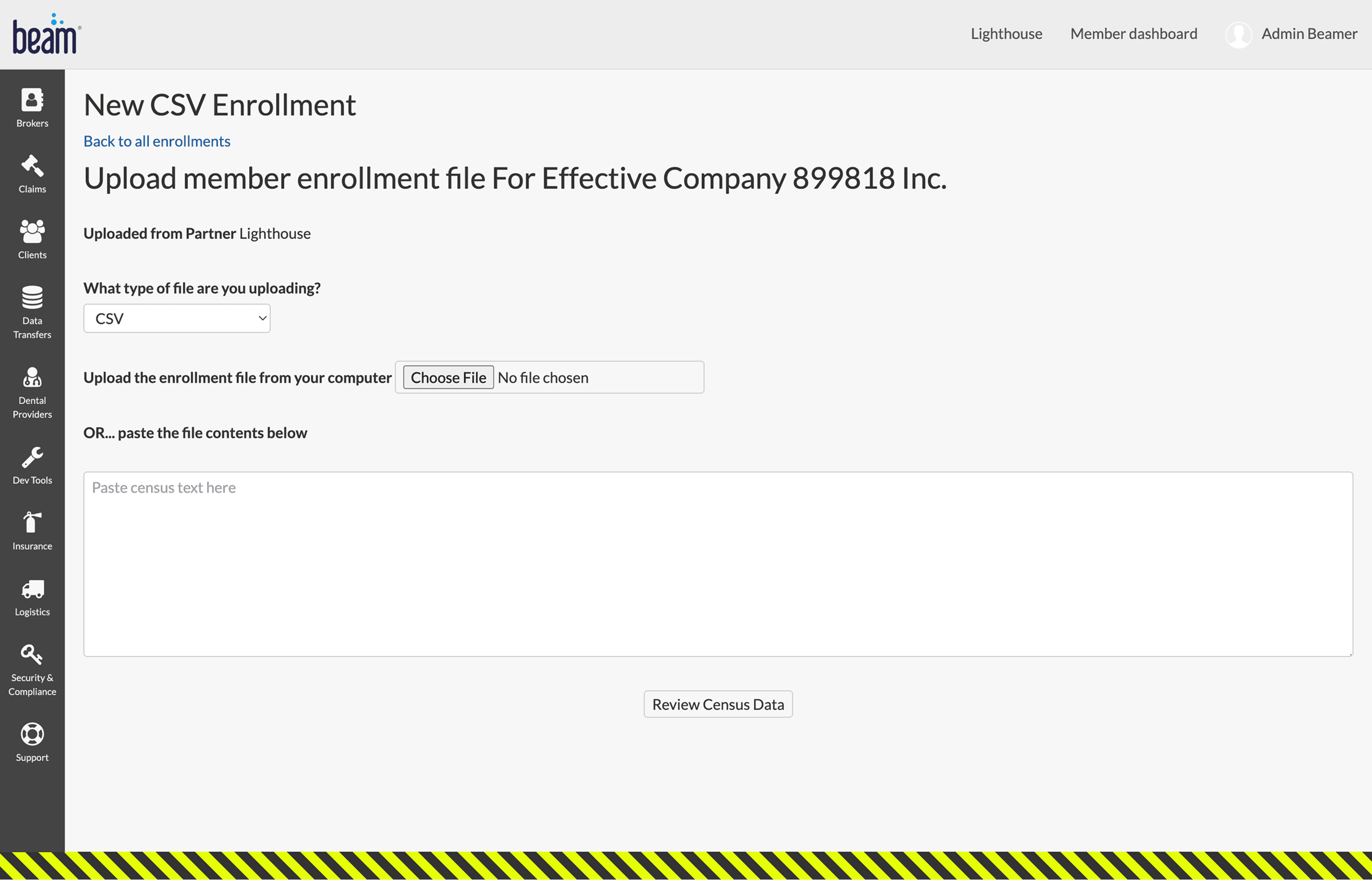
(1/3) Current Admin experience for uploading a census file
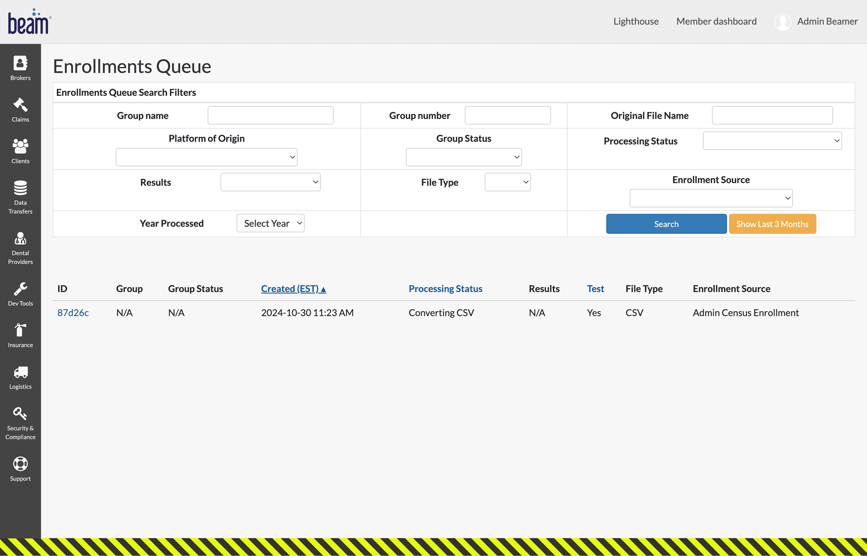
(2/3) History of census file uploads (sample shown here)
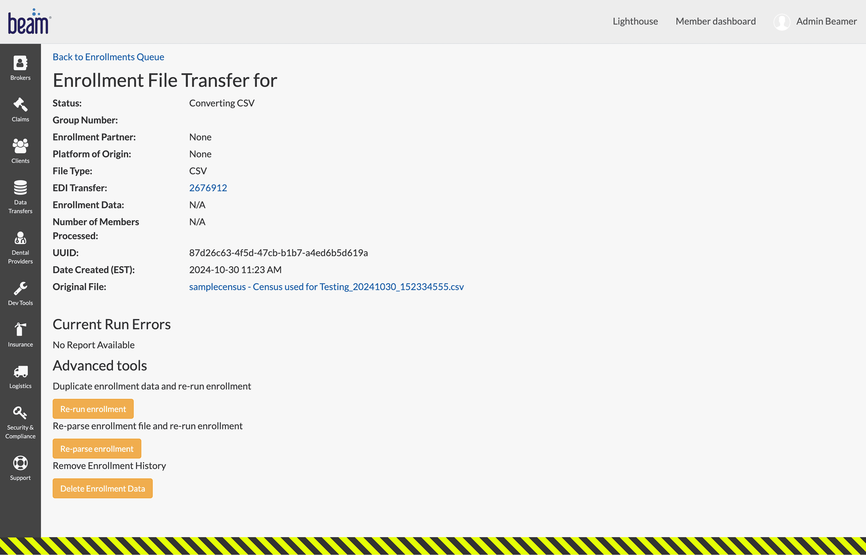
(3/3) Details about the census file just uploaded (clicked on '87d26c' from prior screen)
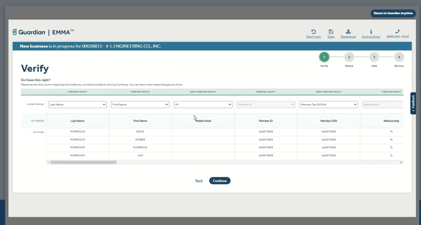
...even less surprising when considering competitors like GuardianLife's EMMA platform, or MyEnroll360 by Benefit Allocation Systems, Inc...
...and, of course, there is the census enrollment upload experience in Beam's quoting tool.
Play at the 4:00 mark (or click here to open video in Loom)
This experience was an embedded add-on within the overall quoting ecosystem and thus did not have many robust features. Here was an opportunity to expand capabilities. Before designing, I wanted to ensure alignment with the involved PMs for my design direction by first mapping our the experience. This initiative had some important backend work being done in parallel, so I wanted to account for that:
The PM team was working on introducing a smart parsing and matching backend process that would absorb data fed to it, attempt to standardize the data formats and match them to appropriate data points (columns), and re-present it to the end user in the UI to further refine or edit (if or as needed).
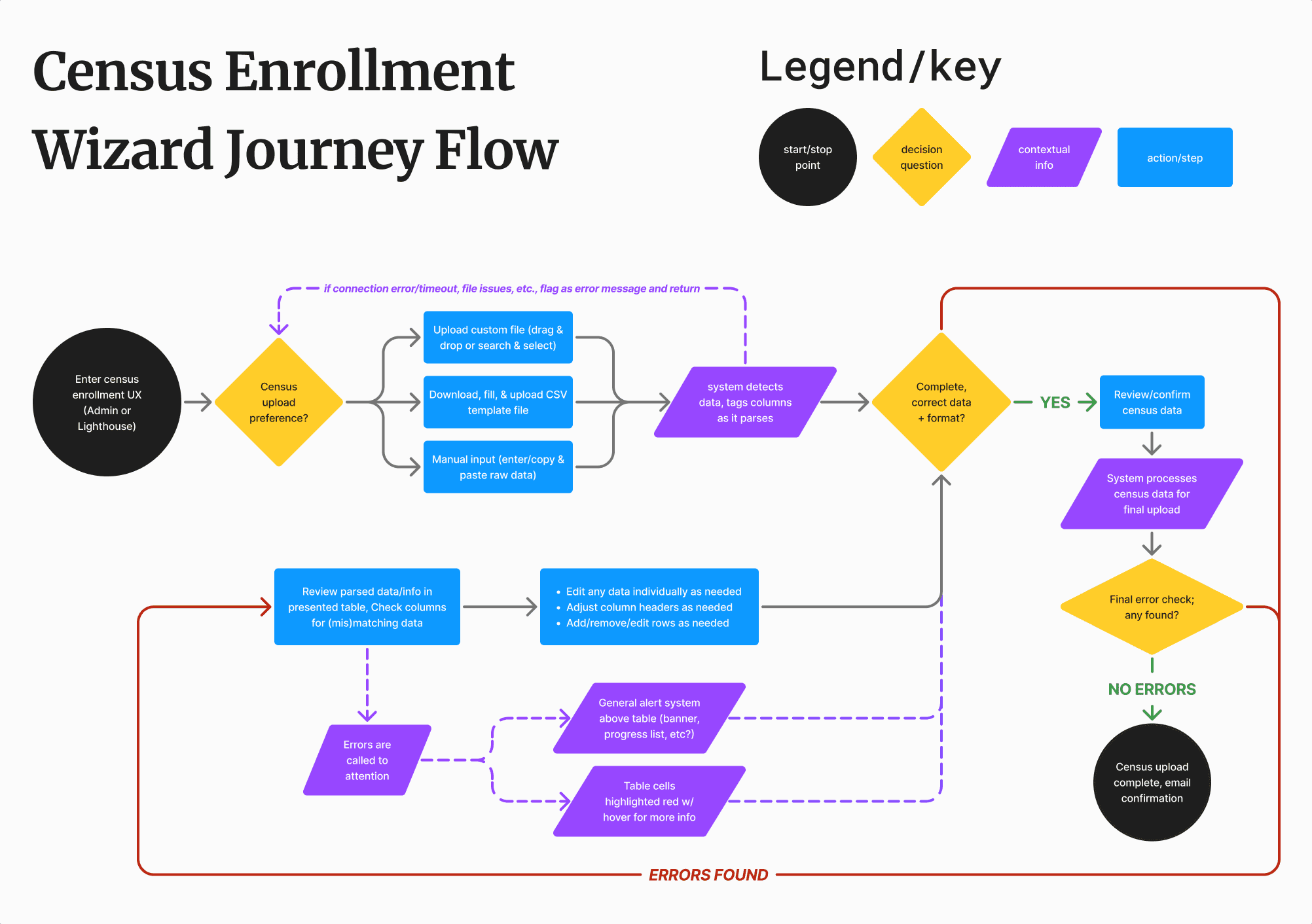
Flow ideation for the census enrollment experience. Press image to enlarge.
With everything laid out now, it was time to start prepping some designs!
I broke out sketches into 2 buckets so I can give each aspect proper consideration:
Upload options screen
Census data edit screen
I then discussed my potential approaches with the PM team for any technical considerations and the UX team for any other design considerations.
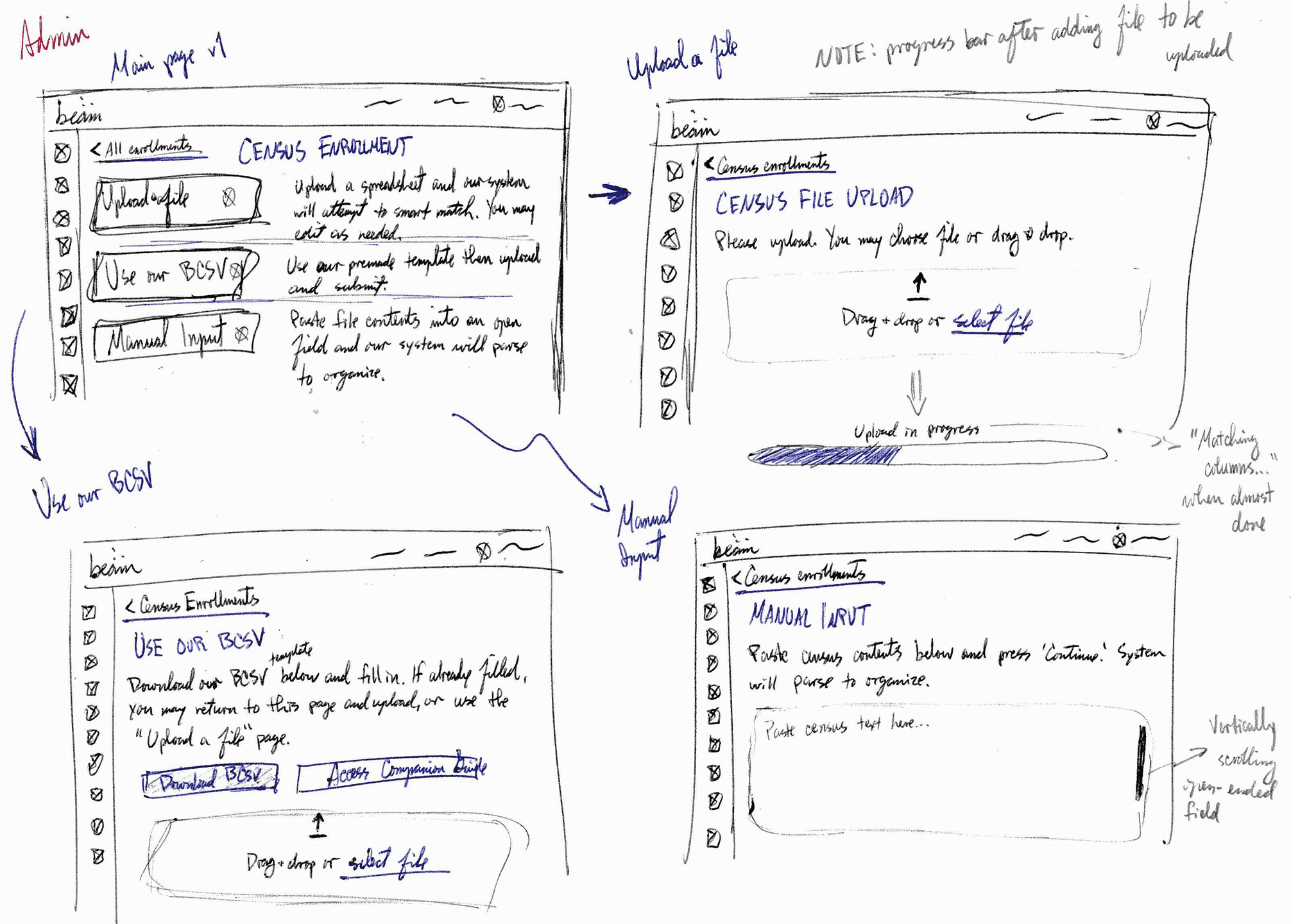
(1/2) Approach #1: each upload option as a CTA button
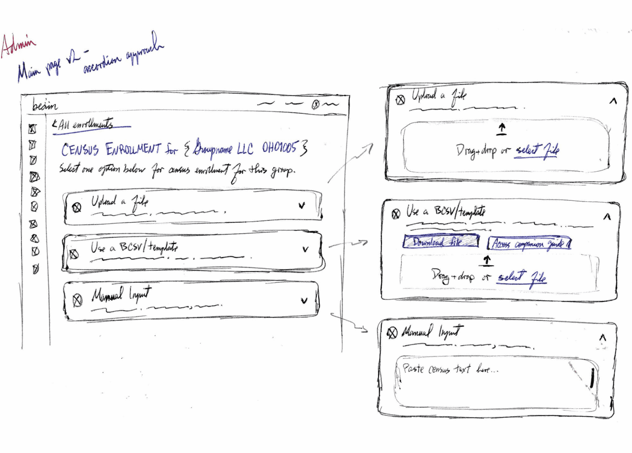
(2/2) Approach #2: each upload option is embedded in an accordion
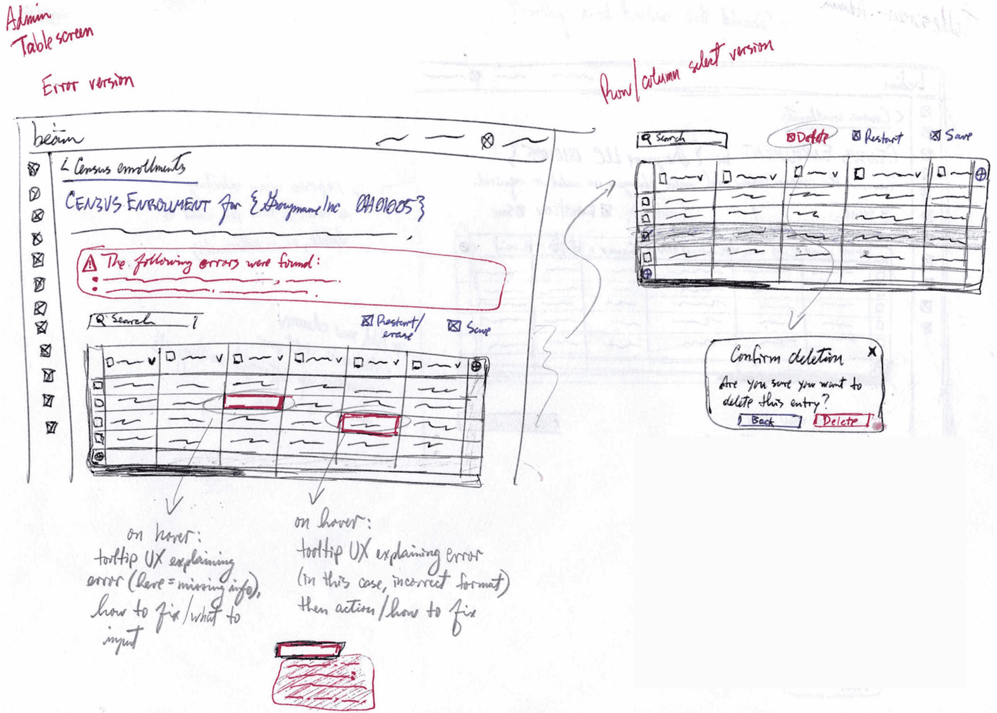
(1/2) Error handling
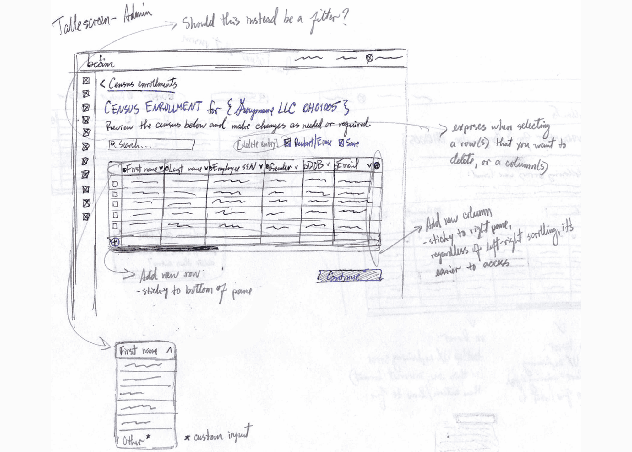
(2/2) Table functions
I decided on the accordion approach for upload selection, with the 'Upload a file' option expanded by default (to maintain some visual consistency with the quoting tool experience). The team and I were happy with the concept for the table screen, but I would need to dig deeper into how error handling would work, so I moved on to high-fidelity mockups to gain a better sense of how I wanted to address this feature.
Time to cook up this experience. 👨🏽🍳
I collaborated with the lead designer for Beam's quoting tool; he owned the entire design experience ans was very knowledgeable about its nuances. Although this project was different, there were still some design directions and ideas that overlapped and could be implemented here; this proved a very fruitful conversation. Notable examples were:
There was also opportunity to deep-dive into creating a design system component (a 'molecule,' relative to Brad Frost's atomic design framework) related to error-handling and progression/resolution. I experimented with gradient vs solid brand colors, considering potential colorblindness issues too.
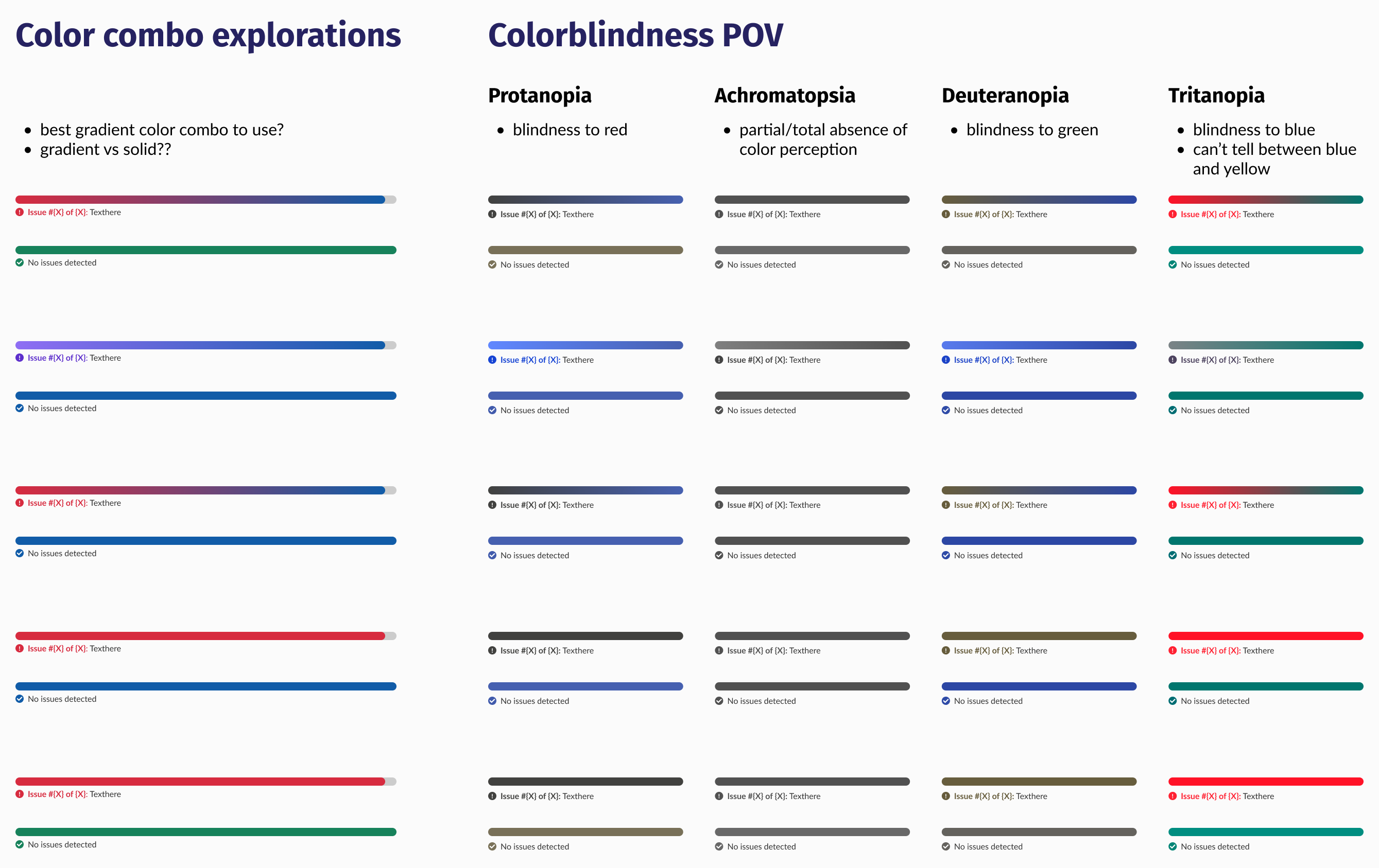
Error handling/progression explorations. Press image to enlarge.
As cool as it would have been to use gradients here, it made more sense to use solid colors from an accessibility and technical POV (engineering the gradients would take extra time and effort for little to no value).
After designing a few key screens for the UX Research team, they ran tests and integrated questions about his new experience concept into interviews they were already conducting with brokers and HR admins. They asked interviewees to rate and score using a SUS (System Usability Scale) scoring system, to favorable results.
Average SUS score for the census enrollment mockups ('acceptable;' the uppermost range for this rubric)
Then came the fun part: weaving the web of interactions together, baking in all the various interactions, letting it marinate here & there, until we had a full prototype review to showcase.
Note: Design, Product, and Engineering all agreed to:
• consolidate the census upload 'custom upload' and 'template' options into 1 accordion
• repurpose the current state manual input to load a blank in-app table that one can manually enter data into
• rename the existing experience's manual input to 'Smart-match raw data'
The design was well-received by all teams...but unfortunately capacities and priorities shifted last-minute, so we had to pivot to a more basic design concept, outside of the Admin platform (this was the most technically complex system in the entire organization, compounded by the fact that there were no built-in design system elements from UX or Engineering).
Due to shifting business needs, timelines, and priorities at the time of building out this census enrollment prototype, the engineering team, product managers, and I came together to discuss best next steps.
We decided on building a 'lighter' version of this experience in our Lighthouse system, since it would be much easier to recycle design system components from the developer library as opposed to re-building them in a new system that needed a massive overhaul, resulting in the following design choices:
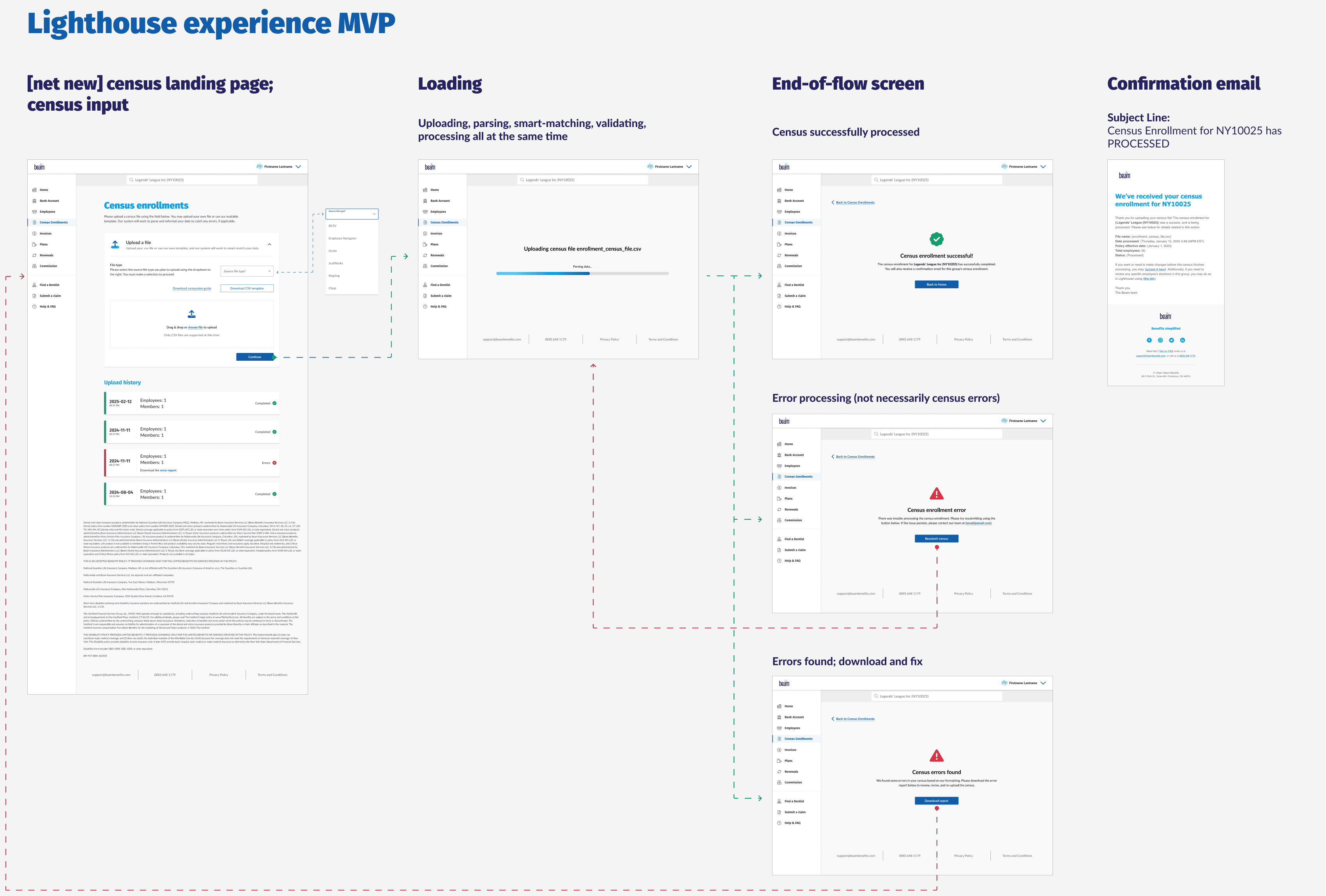
Proposed census enrollment MVP. Press image to enlarge.
Our resident graphic designer, lead product designer, and I decided it would be fun to explore ideas for visual delight within the loading screens of the census enrollment experience. Although nothing came of it in the end due to the previously mentioned shifting business needs, there was a good foundation being built for similar experience moving forward. Here are the concepts we wanted to further explore.
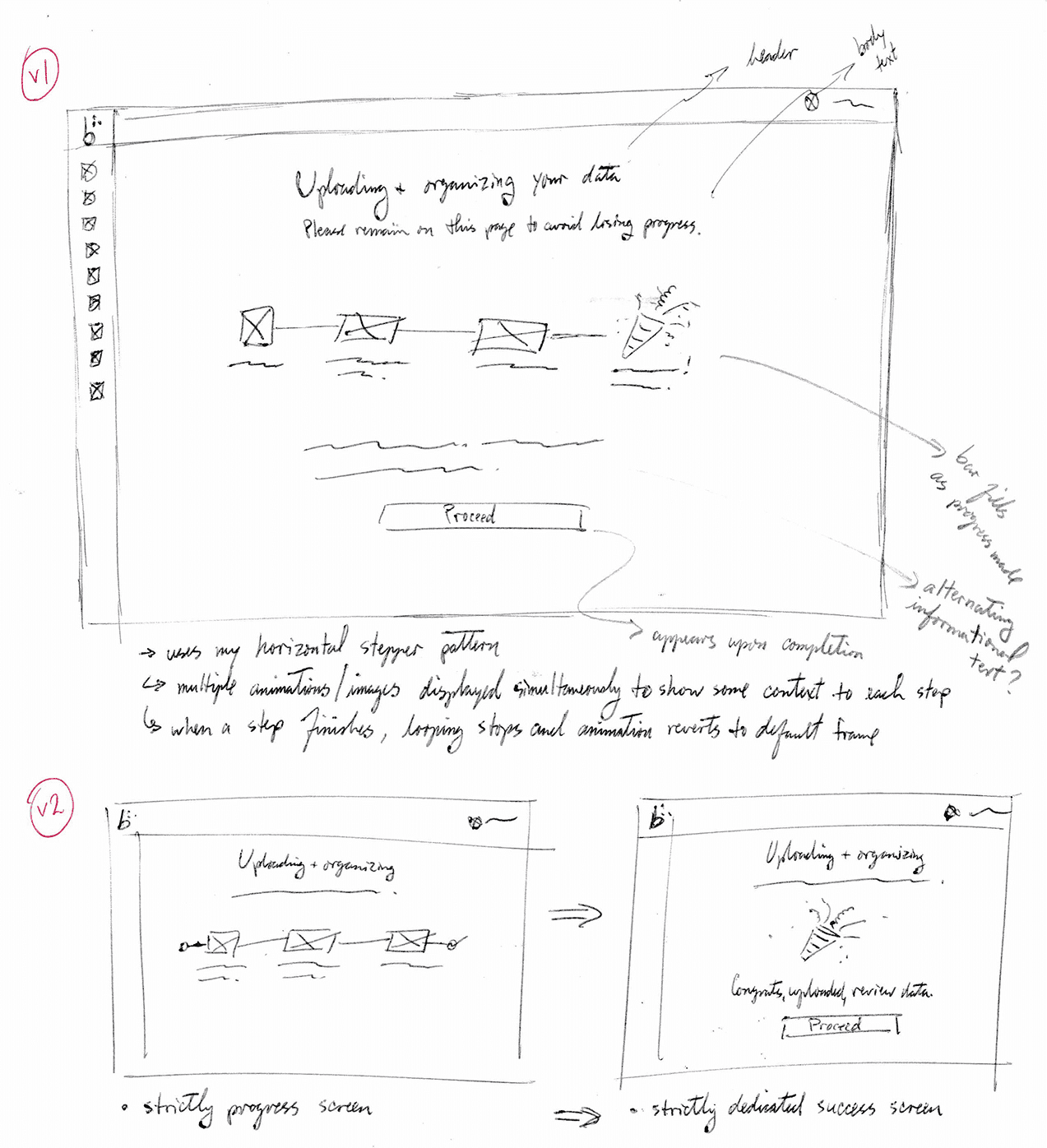
(1/2)
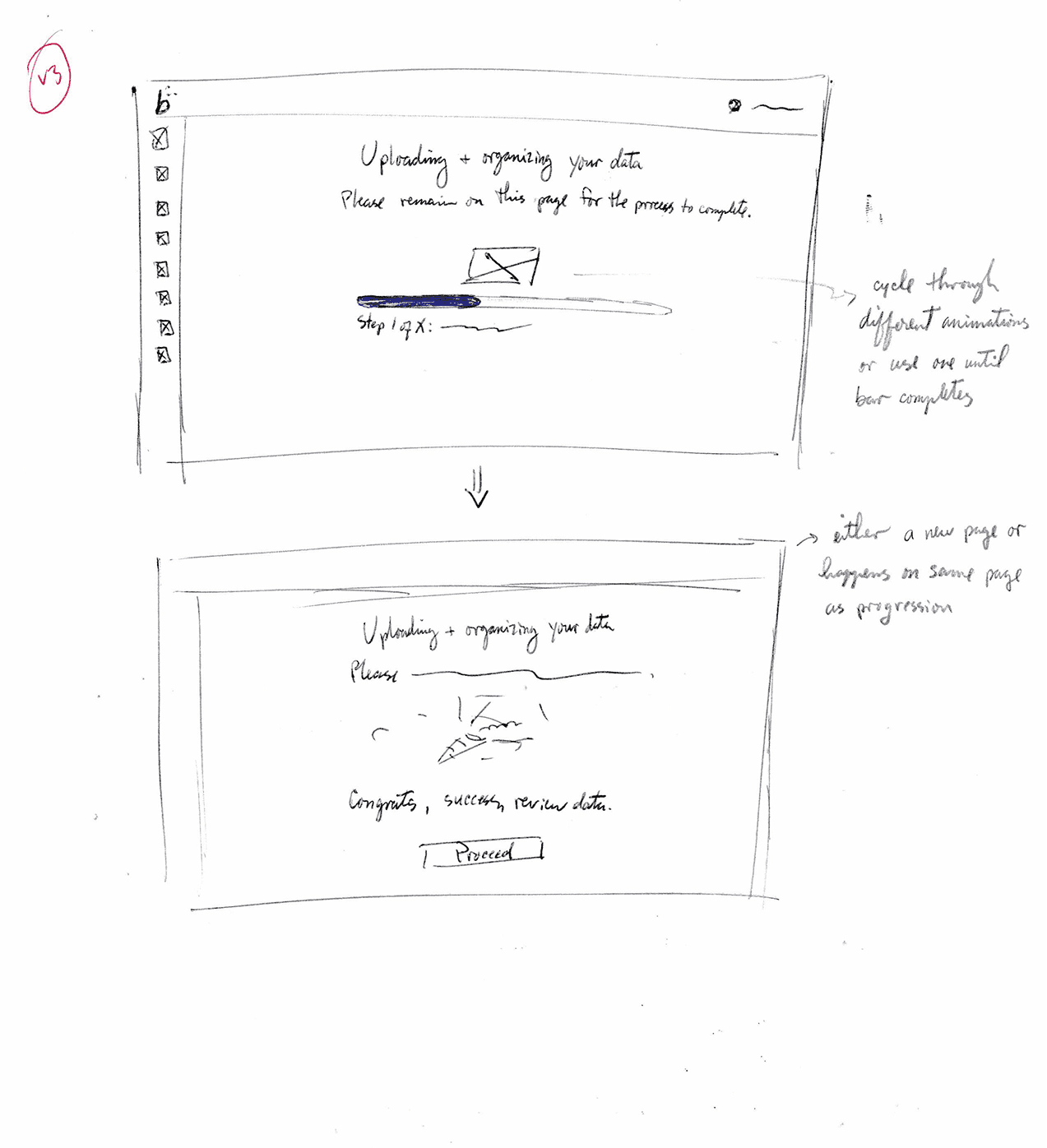
(2/2)
While this initiative was deprioritized (scheduled to begin development in Q3 2025), we as a team were confident in the directions for the MVP designs. The plan would be to build that out, test it in real-time, and as feedback is being gathered, start work on the main course in Beam's Admin system.
This would enable anyone working with census files to feel confident in submitting their data files, knowing that Beam’s system will easily flag any actions or corrections needed. After all, looking at the same excel sheet for too long can drive anyone mad!
UX design | Information Architecture
Digitizing a paper-mail application experience to provide near-instantaneous decisioning for people requesting additional insurance coverage.