Find a Dentist
Redesigning Beam's dentist search experience led to users spending 90% less time finding an in-network provider.
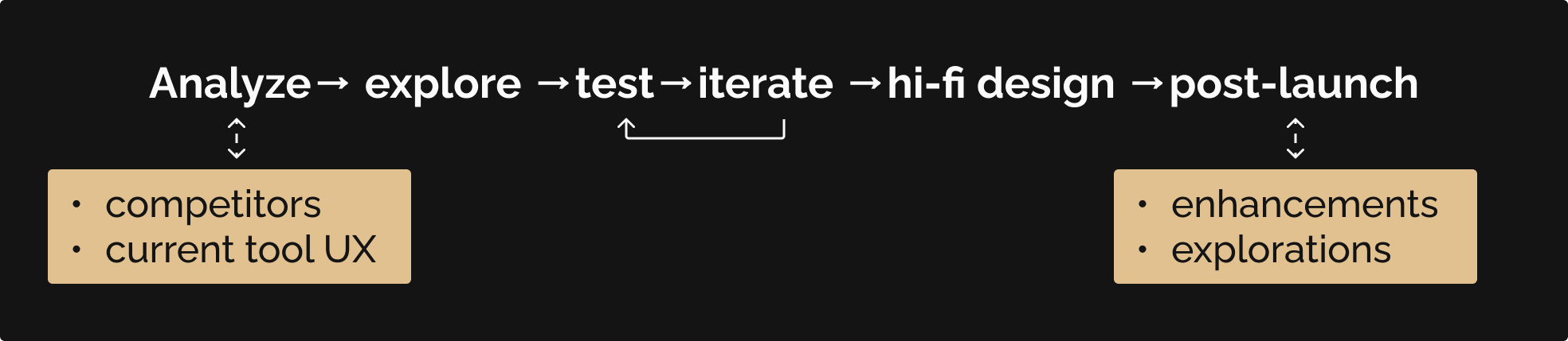
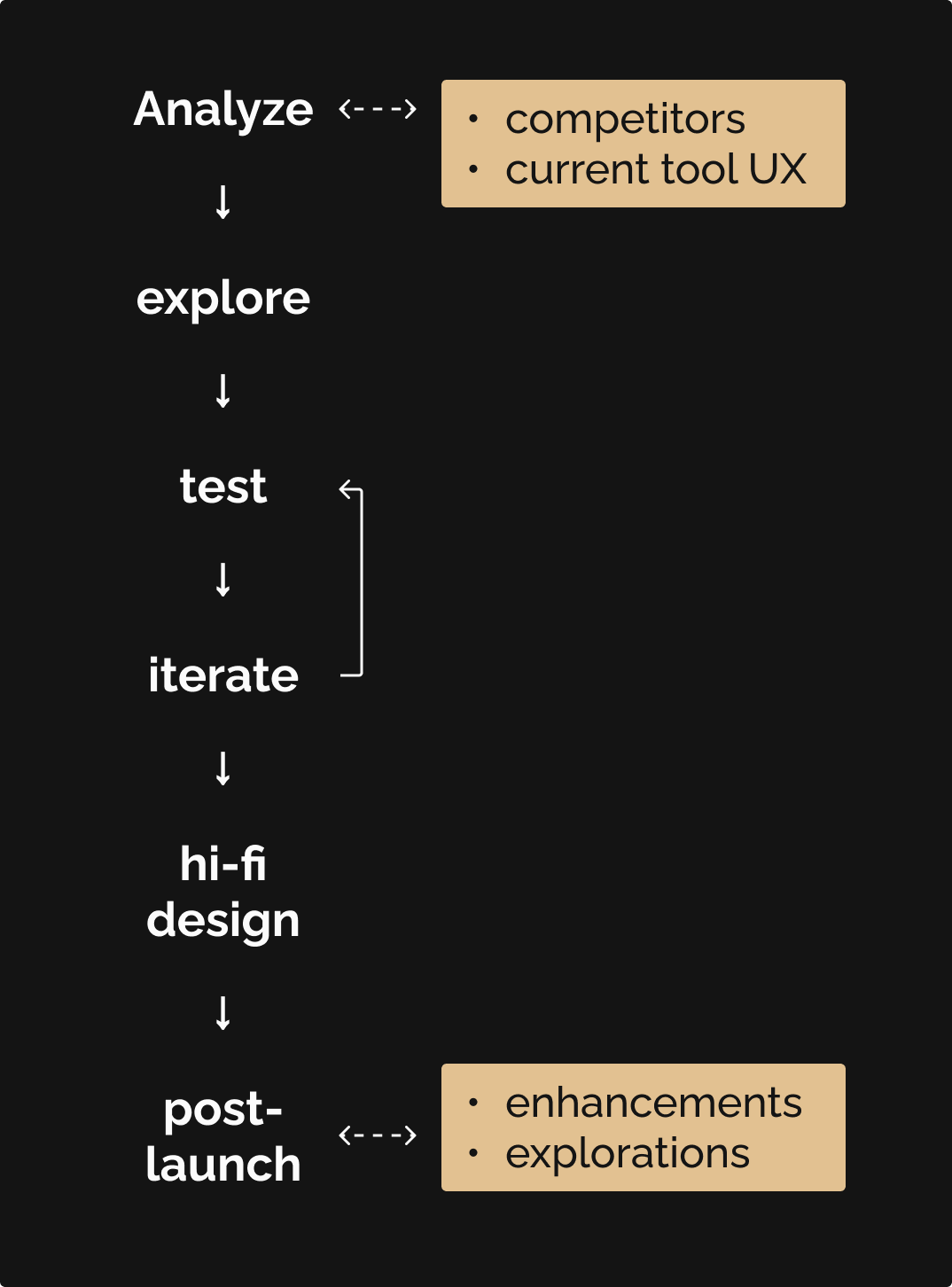
8 weeks total
Research
UX design
UI design
Usability testing
Pen & paper
Figma
Google Meet
Mouseflow
Beam's 'Find a Dentist' tool hadn't been updated in a long time. As such, there were some vulnerabilities and concerns with missing or inaccurate information, and the experience was not mobile-friendly or accessible (>40% of visits were on a mobile device). Site visitors would spend up to 5 minutes to find the office or information they needed. Additionally, we noticed that over 40% of dental claims that members filed were with out-of-network (OON) offices, which (at 1% ≅ $115k in additional costs) comes out to a $4.6 million loss that the business can and needed to mitigate. So we asked:
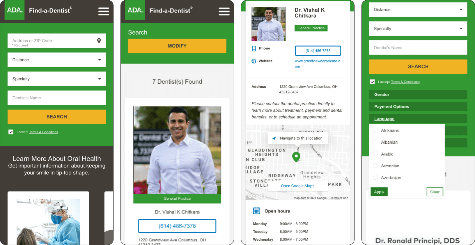
My attempt at using the 'legacy' tool. Click here to skip down to an image of the desktop experience.
Additionally, we noticed that over 40% of dental claims that members filed were with out-of-network (OON) offices, which (at 1% averaging $115k in additional costs) comes out to a $4.6 million loss that the business can and should mitigate. So we asked:
I took a more linear approach for this initiative, considering what makes a good provider search experience and where/how we can close any high-priority gaps in our search experience.
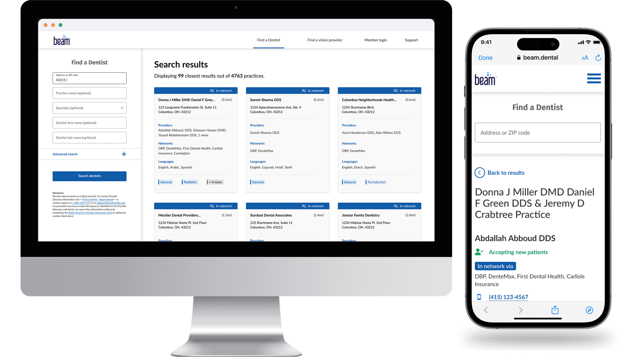
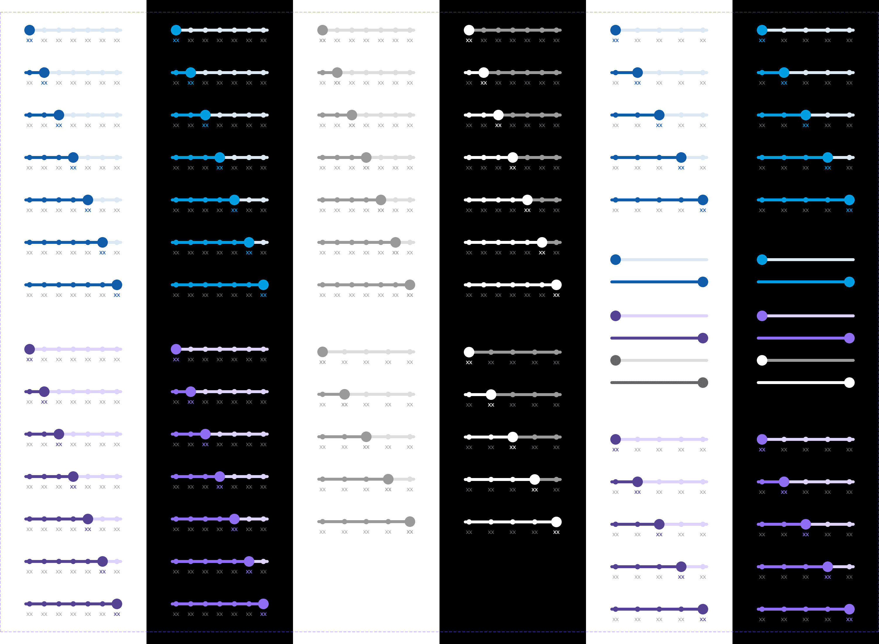
The updated 'Find a Dentist' design resulted in an up to 90% faster search experience for visitors, providing clear hierarchical information as well as new details like:
We used the blank state of the search experience to include brief messaging and a link to educate members how they can save by visiting an INN vs an OON dental office, to reduce that 40% OON claim filing as much as possible. The best part: it is now mobile-responsive!
The Find a Dentist tool was first built with minimal UX involvement in Beam's earlier stages. This, combined with the insights that the product and analytics teams had found around the tool's functionality and member (not) visiting in-network dental offices, meant that the experience needed an overhaul.
of visits to Find a Dentist were on a mobile device
of dental claims that members filed were with out-of-network providers
added costs; every 1% of out-of-network claims costs Beam $115k
With the above in mind, we first analyzed a handful of medical provider search experiences, and noted the following themes:
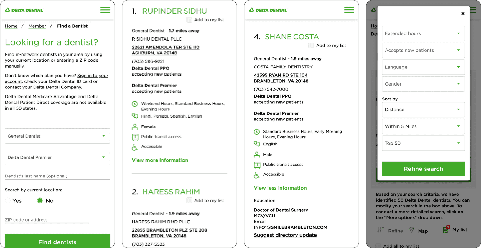
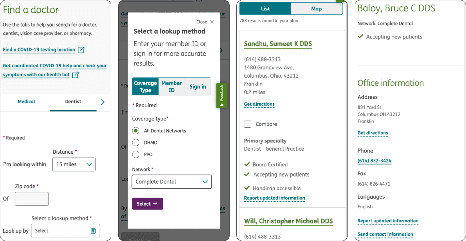
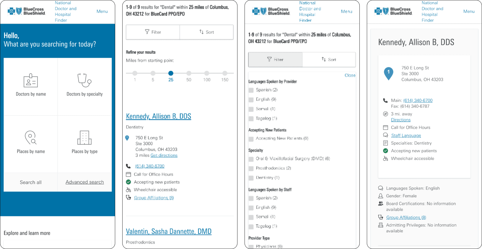
With regards to Beam's dentists search experience, we noted (based on our observations and on customer feedback):
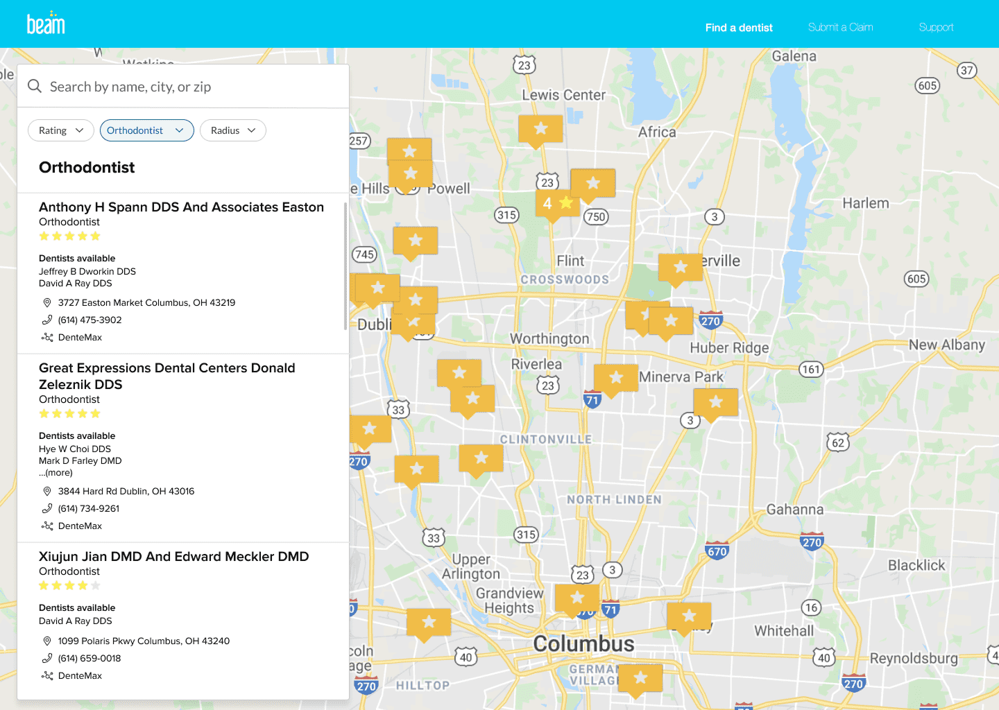
The old F.A.D. desktop experience. Click here to go up to the mobile experience.
In short, there were many opportunities for updating Beam's dentist search experience!
Because this project had a 6-week window of completion, with expected post-launch updates and other technical limitations to consider, some of the features and feedback we wanted to implement immediately would need to be delayed. As such, I explored potential solutions without a map view. Priorities for initial launch included:
Updated search parameters
Updated search results
The new digital real estate taken by the map would instead be used to communicate the value for site visitors and members going to an in-network dental office vs an out-of-network office, in an effort to close the 40% OON claims and resulting $4.6 million in additional costs to the business.
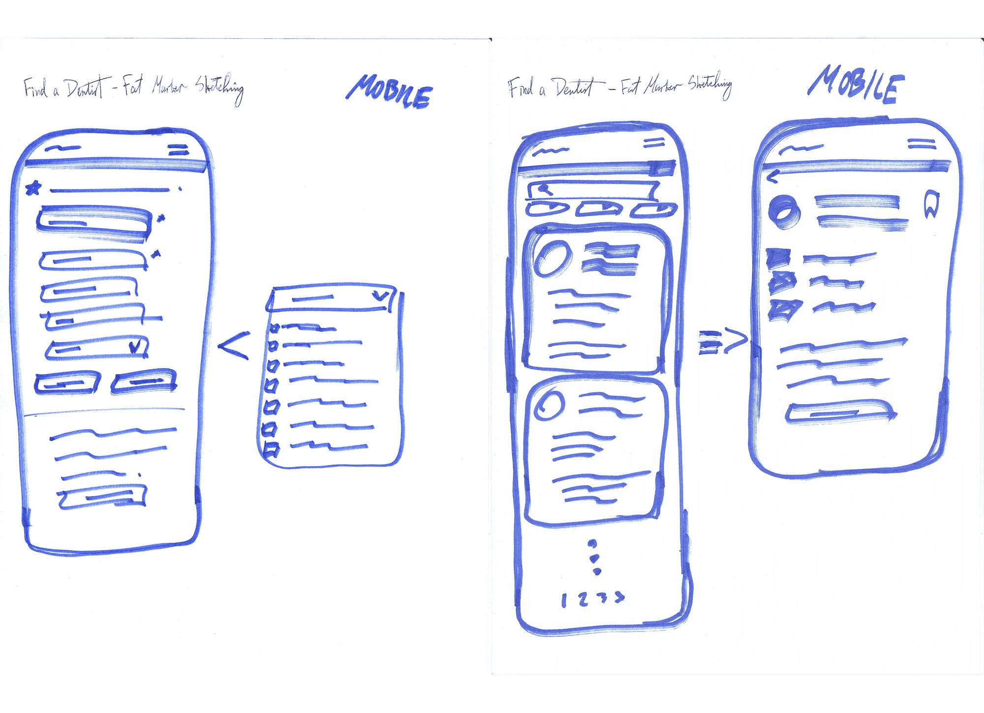
(1/4) Fat marker sketches
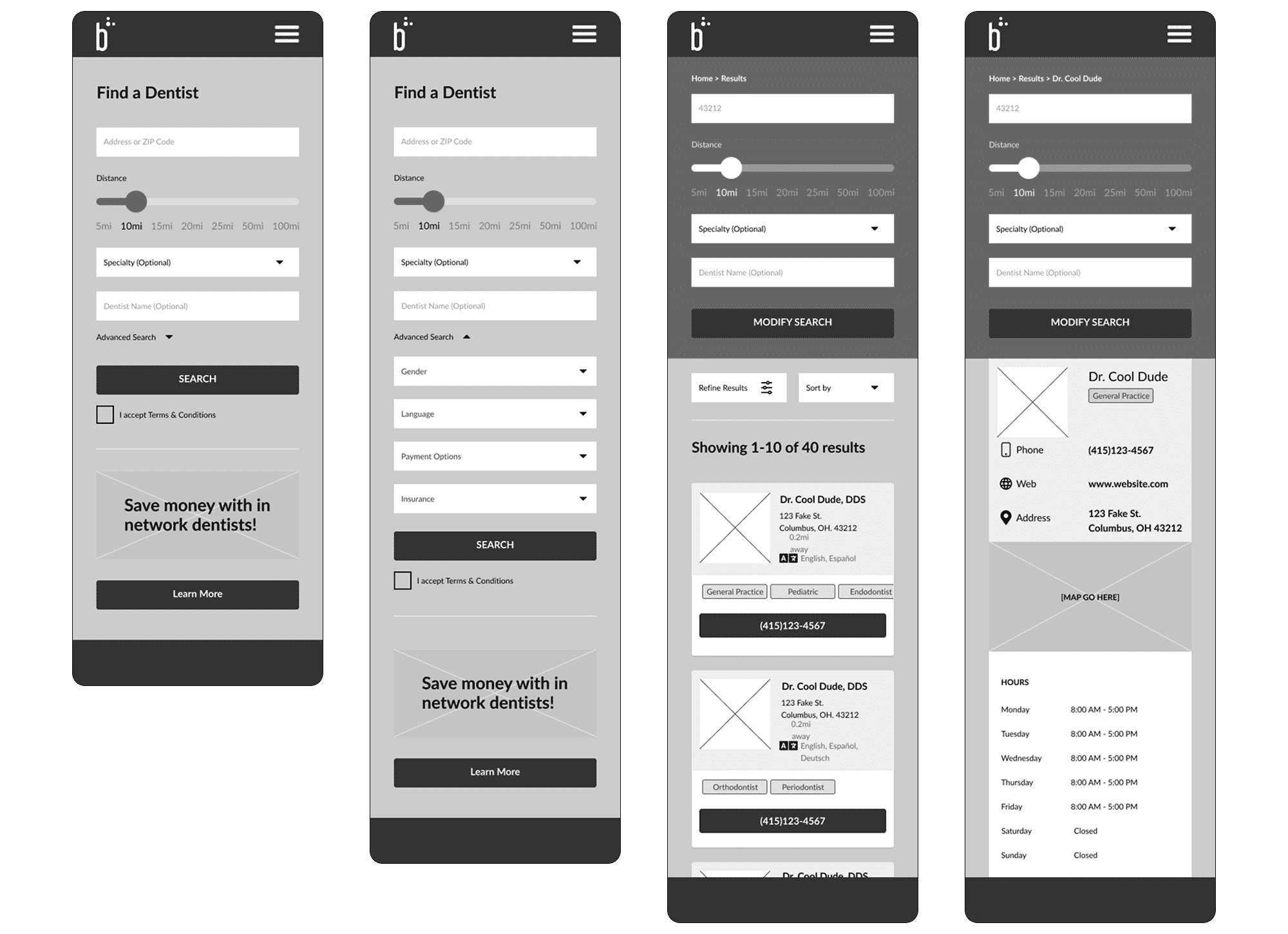
(2/4) Mid-fidelity wireframes (used for internal usability tests)
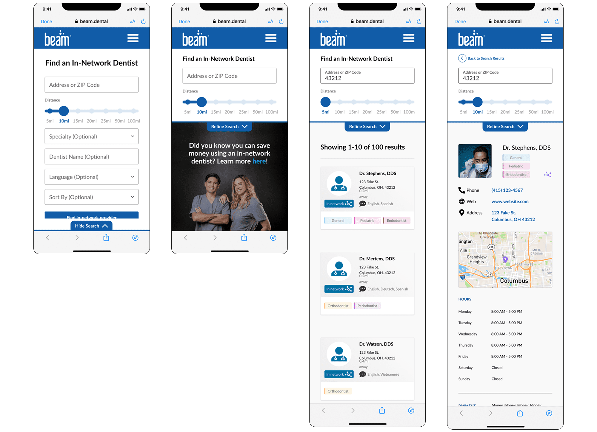
(3/4) high-fidelity screens - round 1 (used for external usability tests)
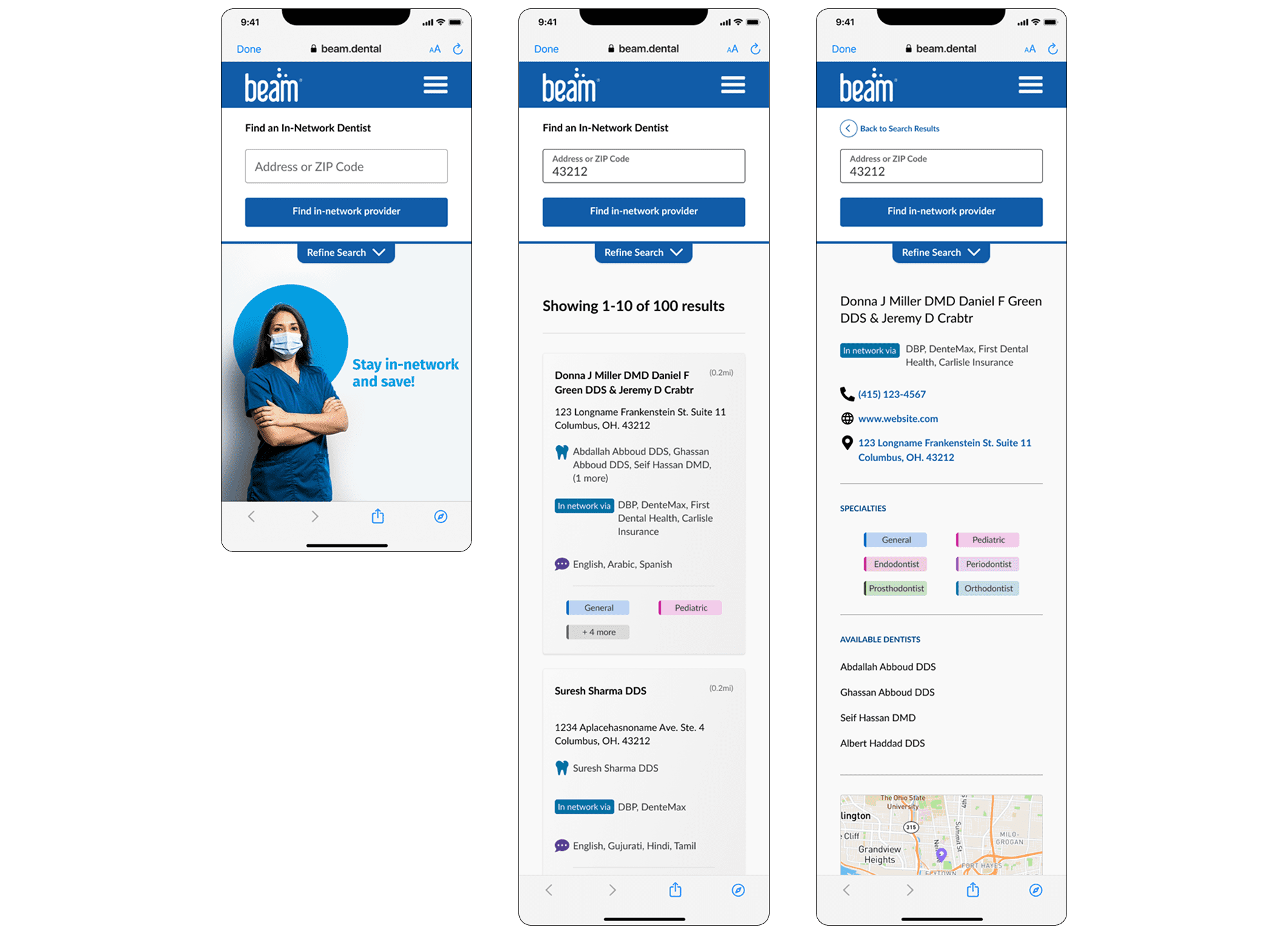
(4/4) high-fidelity screens - round 2 (used for internal + external usability tests)
Note: with a co-designer and senior design guidance, we explored potential solutions as a team through sketching and whiteboarding, then diverged to flesh out the desktop and mobile experiences. I worked primarily on mobile.
After creating a simple but satisfactory first iteration, we reconvened the drafted a research test plan for getting feedback and iterating on designs. We first tested internally, revised based on feedback, then updated design fidelity and tested externally, refined again, and re-tested one more time for both desktop and mobile experiences.
The essence of our research plan for usability testing.
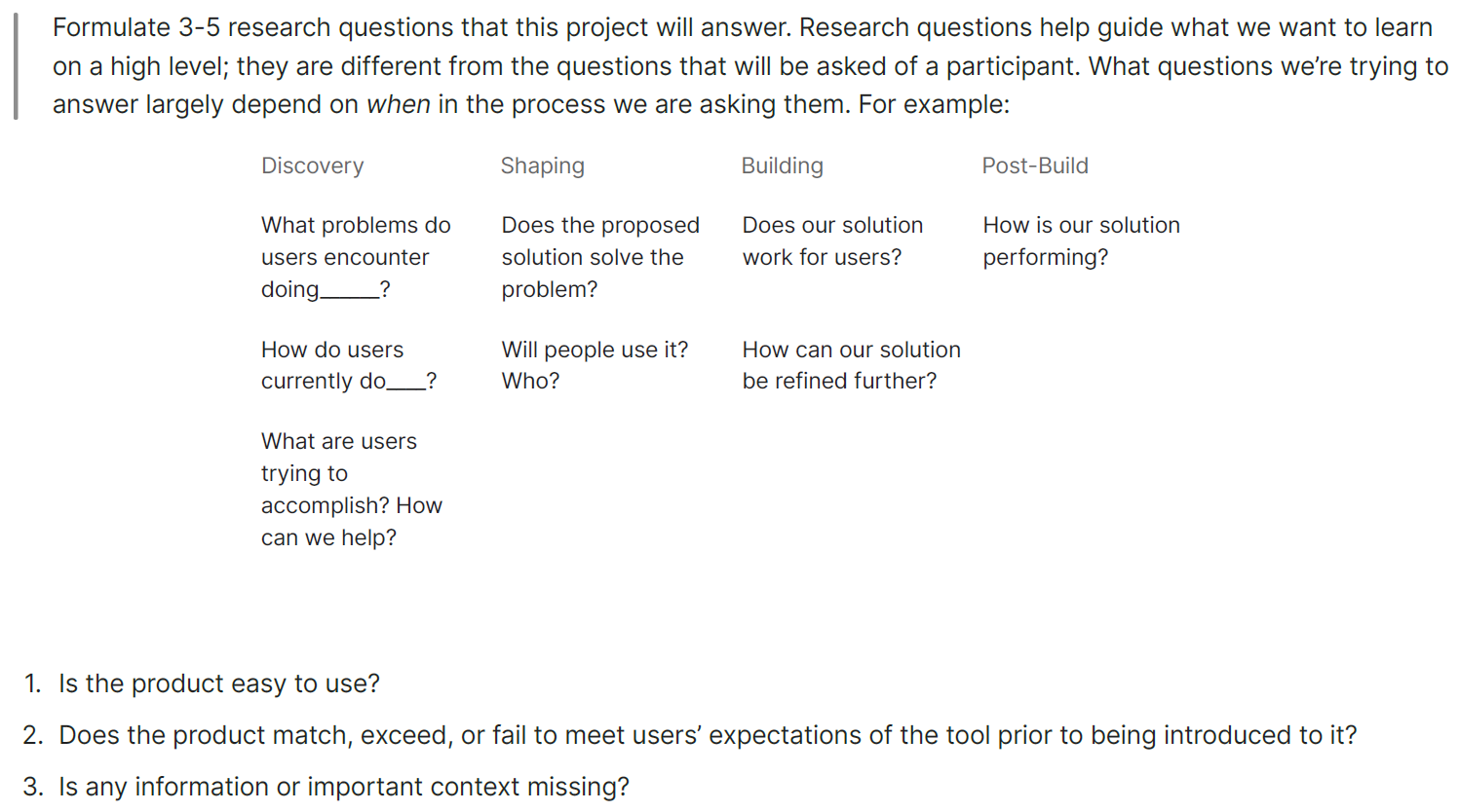
In addressing the need for radius-based search filtering, I realized Beam's design system did not have a slider component, so I created a set to use here and, if needed, in other experiences. This component would be built out in the developer library in parallel with general development of the new Find a Dentist experience. Hooray for fully building out my first design system component!
My component set, using different styles and brand colors. Press image to enlarge.
After testing design concepts for a few iterations, it came time to finalize designs for developer handoff.
Final designs for this first deployment of the new Find a Dentist experience. Press image to enlarge.
By tracking sessions using Mouseflow (we observed time spent and activity on each page for the first few dozen visits post-launch) and hearing ancedotes from random users of the new Find a Dentist tool, we saw a massive reduction in time spent finding trying to find a provider.
We could not immediately gauge how much OON claims were reduced thanks to this redesign, but since we cut out and out-of-network practices from our backend database, we were 100% confident that OON claims would drop significantly.
With the team feeling confident in this initial rollout, we looked to other business needs and goals that were previously out of scope:
We wanted to give members a robust search experience without overloading the page with these parameters, so it made most sense to hide the following behind an advanced search accordion:
Fortunately, these updates were easy to work into the new design.
Note: although the prototype functions like the live experience, some changes were made on the backend to better match the developer UI library and Beam's Figma design system. Thus (as of 06/2025), some aspects of the live tool may be different.
Some of these updates were legal/compliance requirements but also served to further enhance the search experience by allowing for more robust filtering (if desired).
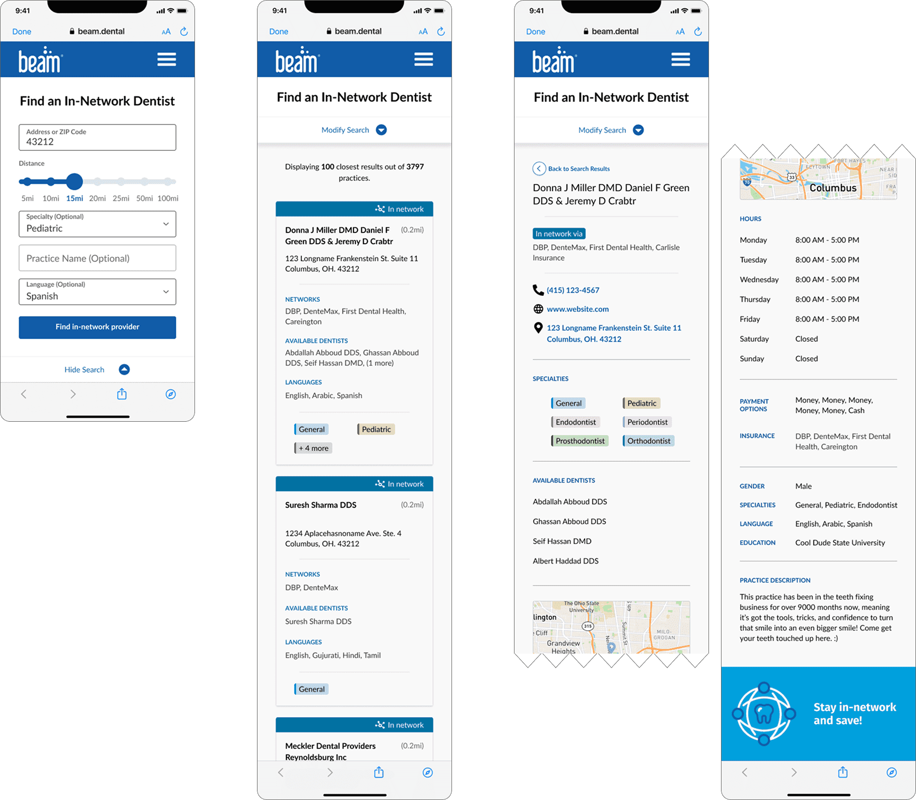
About 1 year later, while in between projects, I wanted to revisit the possibility of including a map view once again, and redesigning the search result cards to: (1) be more visually aligned with Beam's rebrand the prior year, and (2) accommodate a feature for members to save 'favorite' or 'preferred' dental providers.
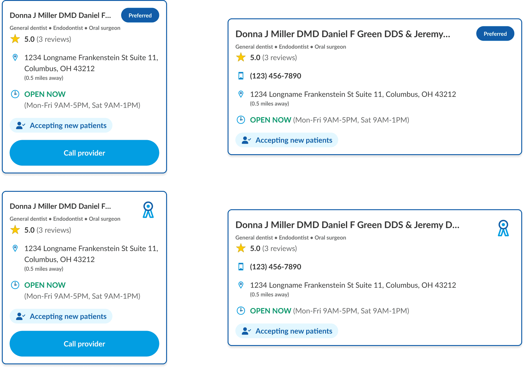
I couldn't fully explore a new map view due to other high-priority projects that came up, but the immediate thoughts and ideas I considered were:
My goal with both the map view and search result card redesign was to provide clearer and more visually nuanced information to people using the tool without sacrificing any of the enhancements we made in redesigning Find a Dentist in the first place. Hopefully they may one day be implemented!
Product design | Prototyping
Designing a time-saving concept for uploading,
organizing, and correcting enrollment census data using
backend 'smart-matching' capabilities.