BeamElect
Beam's new streamlined benefit enrollment experience led to an average 18% increase of employees choosing to enroll in benefits.
4.5 months
Lead product designer
Content designer
Interaction design
Figma
FigJam
JIRA
Small businesses are underserved in the digital insurance benefits space and lack the resources to build out their HR infrastructure like larger companies can. As such, the benefits enrollment process is usually much more manual and time-consuming. Employees struggle to decipher insurance jargon when choosing benefits and thus end up declining coverage more often than not. Beam loses out on $4 million yearly because of this communication gap. Solving for this problem space would attract more businesses looking for a streamlined benefits enrollment experience, and increased retention of current businesses. The core question was:
Video by RDNE Stock project from Pexels
Delivering a proper solution for this problem space would result in attracting more businesses looking for a streamlined benefits enrollment experience, and thus, more revenue. The core question was:
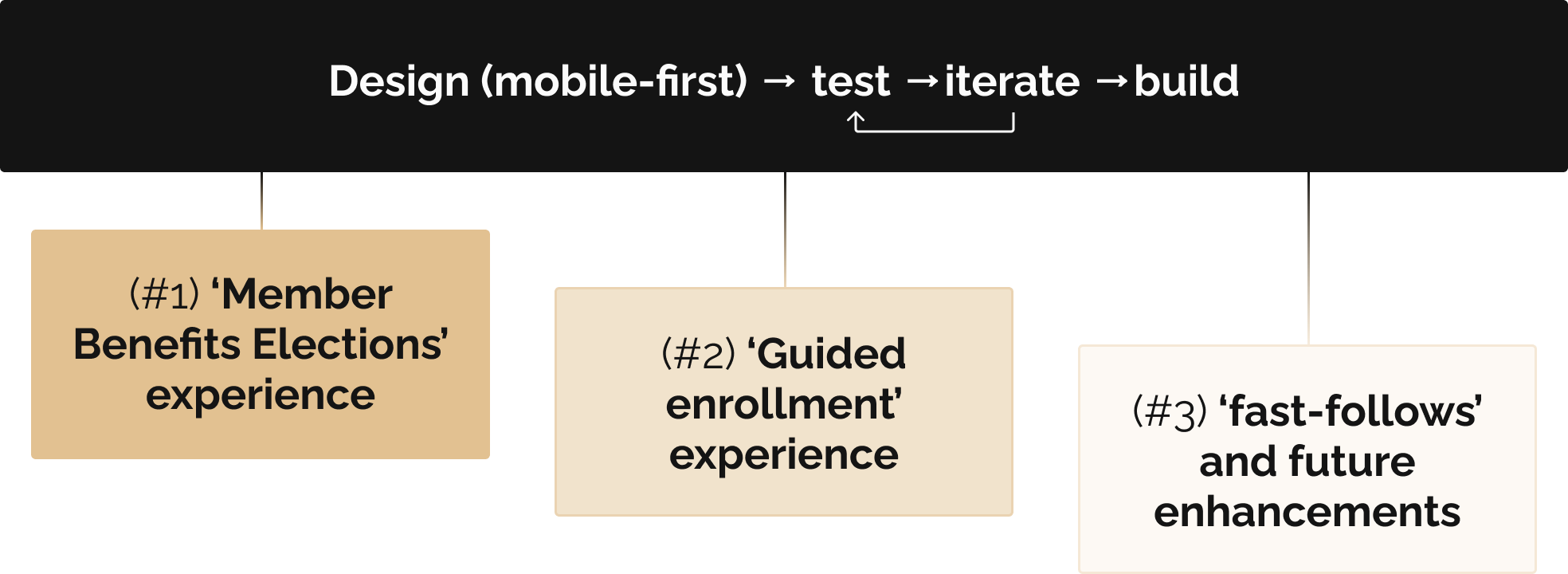
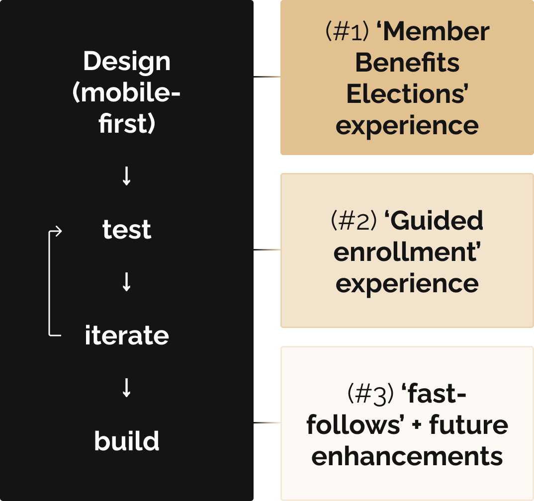
This months-long initiative was broken out into a few parts, to establish prioritization, proper cadence of handoff to developers, and scalability for future additions to this experience:
BeamElect eliminates much of the manual and administrative work that goes into gathering employee benefits requirements, instead providing a tool where employees can learn and make their coverage choices. For businesses that began using BeamElect since launch, the stats speak for themselves:
Since launch, this product has also garnered potential interest from partner organizations to expand and improve retention of their customer segments.
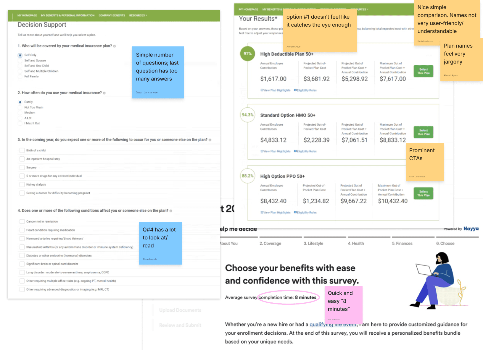
In Q3 2021, the design team wanted to explore a vision of what would plant the seeds that would eventually sprout into BeamElect, without knowing that at the time. What would a self-contained experience look, feel, and flow like, where an employee can learn and understand their insurance options before choosing? Fast-forward exactly 2 years, and Beam had the appetite to go all-in on this concept. our research showed that:
of employees said they don't understand some or all of the benefits being offered to them
of time spent on administrative tasks for benefit enrollments could be spent on other priorities
During our Q3 2023 onsite, the team partook in a hackathon to put together a quick proof-of-concept:
Sample screens from the hackathon. Press image to enlarge.
As the lead designer, I wanted to dig more deeply into this exploration; there were elements that resembled a similar project I had worked on the year before that required listing out benefit details and the ability to choose coverage for employees. Could there be an opportunity to repeat some of the UI patterns for design and development?
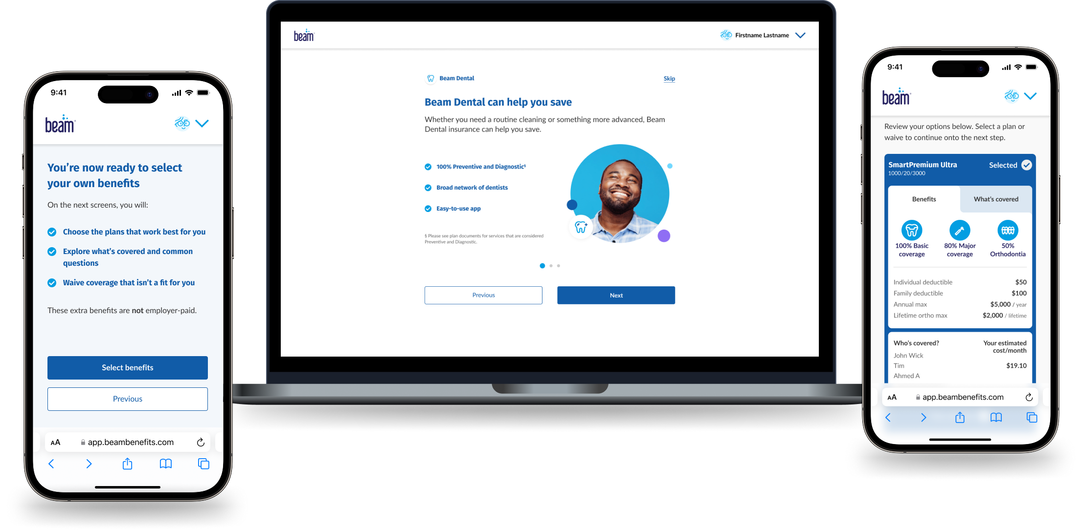
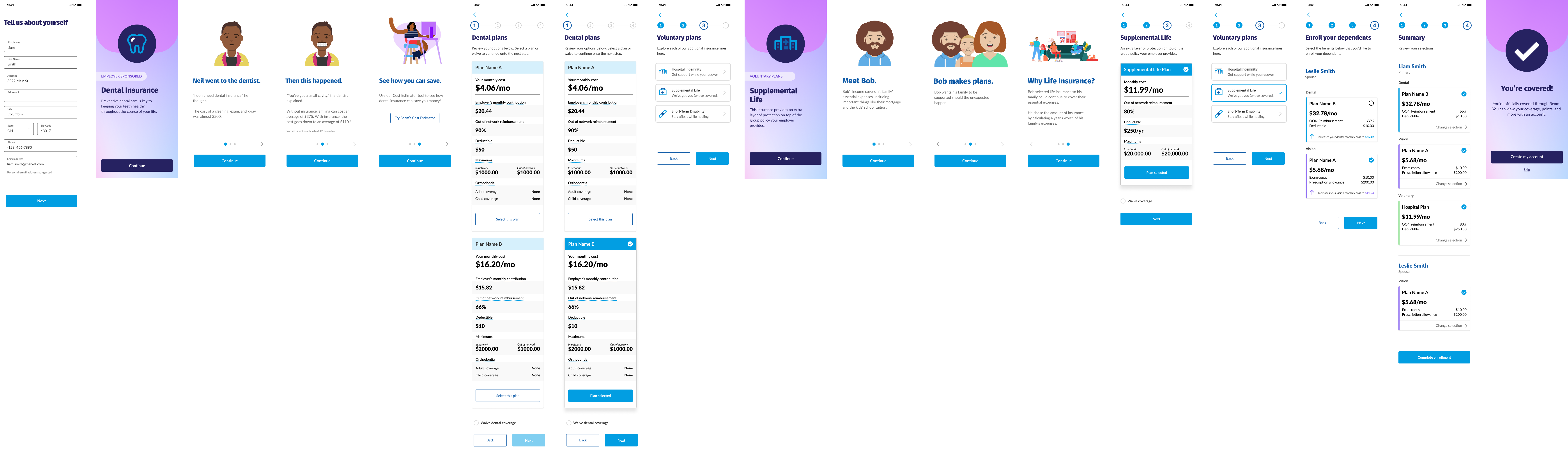
Phase 1 of realizing BeamElect was to build out the 'member benefit elections' experience, where an employee chooses what plan they want for each offered insurance line (or to waive coverage).
Through the first few iterative mobile design explorations I conducted, the project stakeholders and I agreed that the card patterns I recycled from prior work was not relevant or detailed enough to help the average person decide on enrolling in coverage. It would take much more context-setting and knowledge-sharing to get to that point. As such, it made sense to split the work for this phase into two parallel efforts:
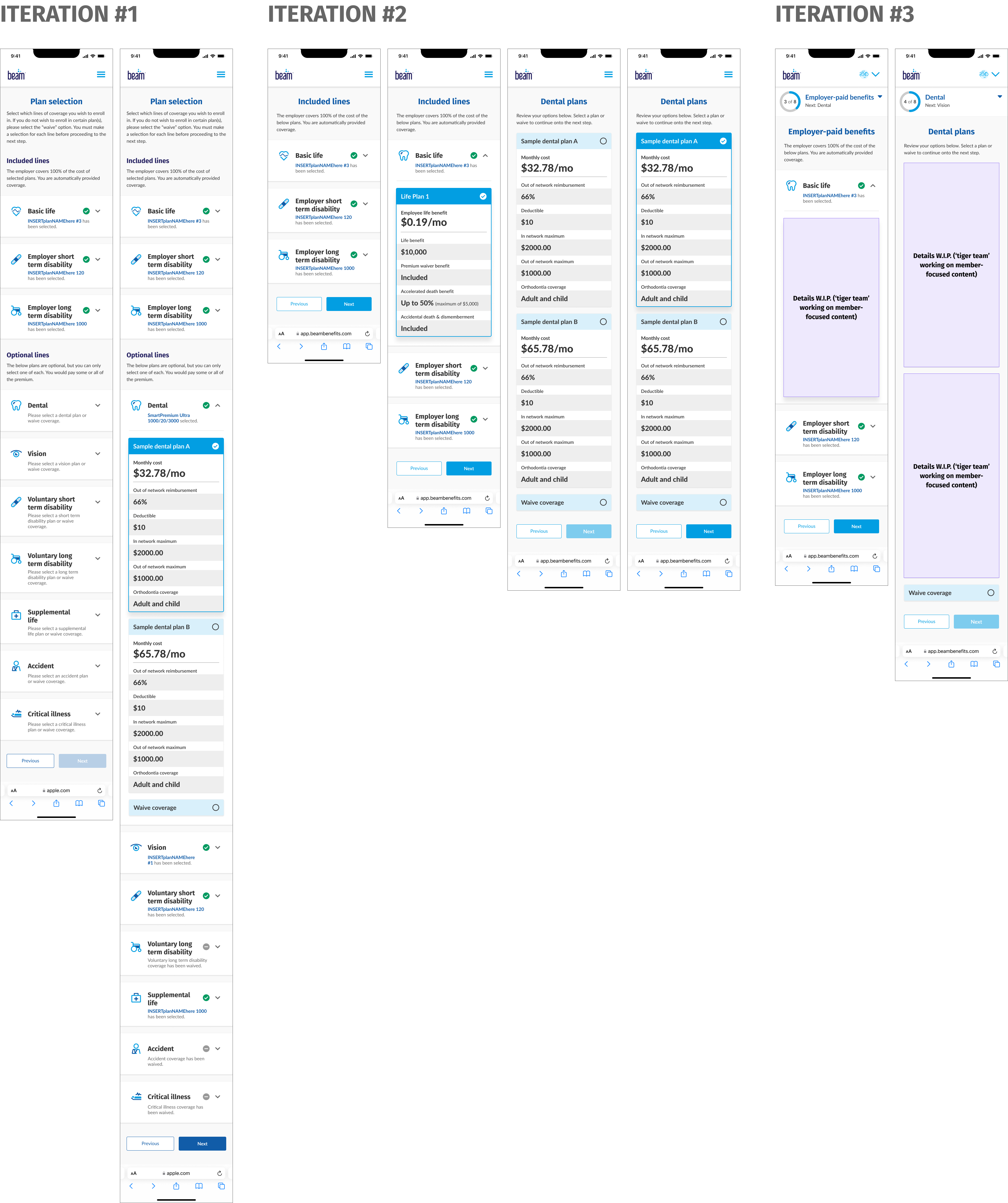
Sample benefits enrollment iteration screens. Press image to enlarge.
While running point on the enrollment experience flow redesign, I partnered with our UX Director and lead UX Researcher on content and UI design for the plan cards, with the main Product Manager and Software Engineers on technical considerations, and with our Compliance and Insurance Product teams to ensure all language accurately reflects what we're offering to businesses. For BeamElect's first launch, we needed to have cards for the following insurance products:
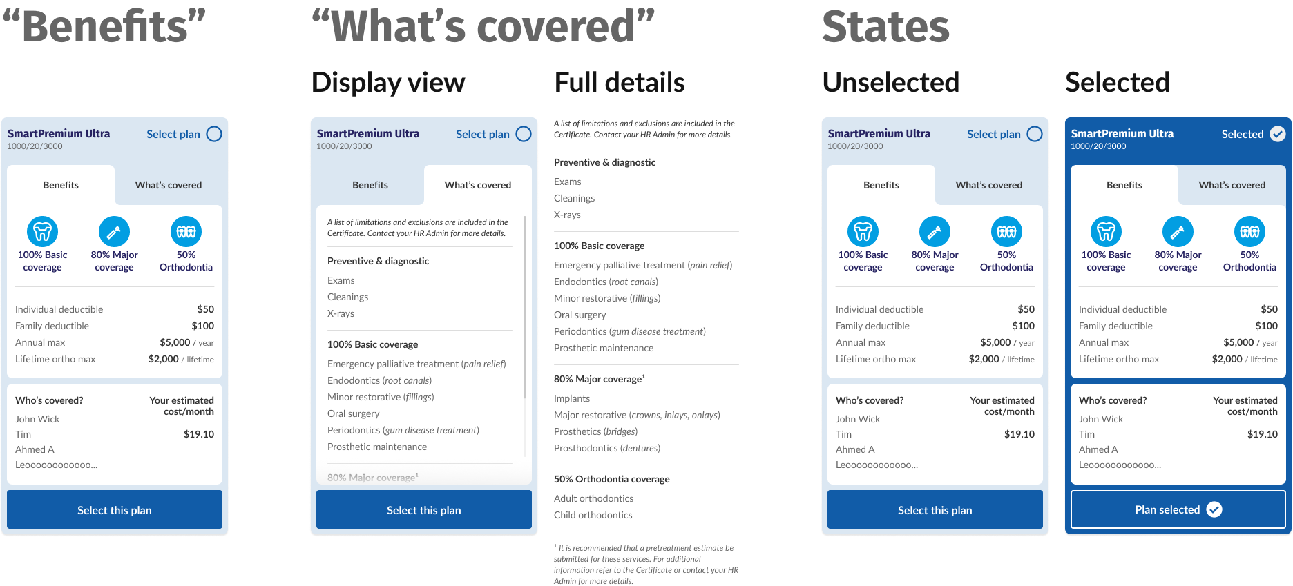
Through a collaborative UX team effort, we explored potential plan card designs, and I took the design set we agreed on to further refine for adding back into the benefit selection mockups:
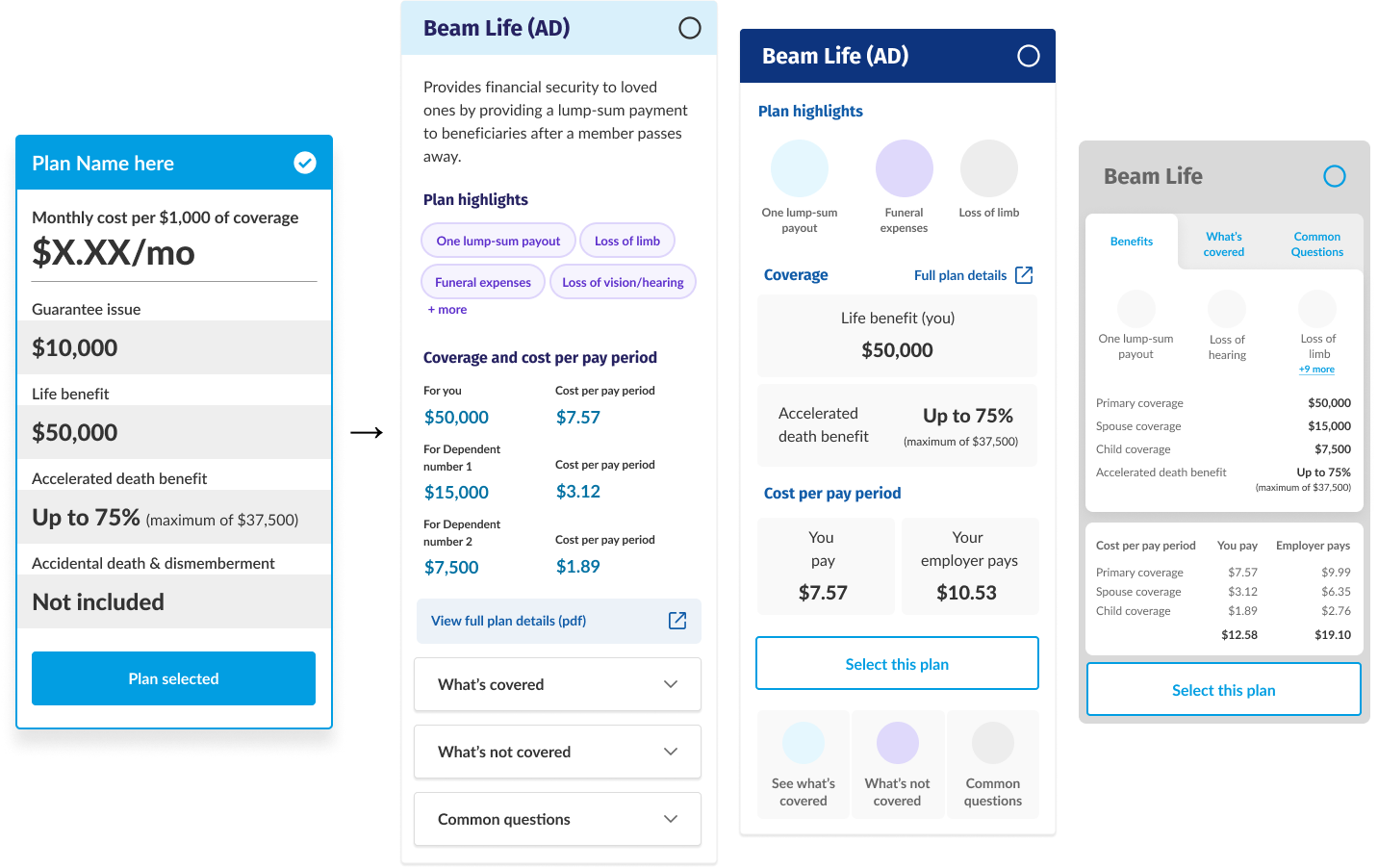
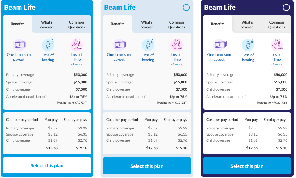
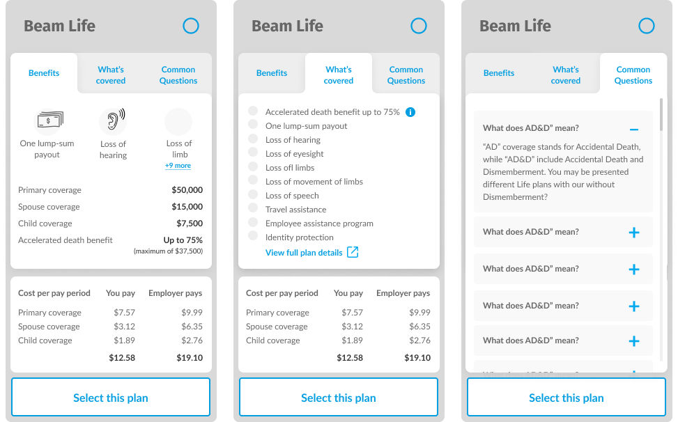
Although we wanted to include a 'Common questions' tab in the card design, UX and Engineering agreed to scrap UI and content development due to time/prioritization and technical constraints, and leaned into the 2-tab card design that displays basic plan information and coverage details. The 'What's covered' tab would borrow heavily from Beam's own plan documents (specifically, benefit summaries) to fill in the relevant information. Below is how I organized plan card designs and content for each insurance line for the engineering team:
Plugging these cards back into the benefit selection flow, phase 1 designs were in a good spot for the engineering team to start development, while I partnered with our research team to begin phase 2: "guided enrollment."
Language is a fascinating tool for communication, and when used correctly, can instill a sense of trust and confidence, especially when making decisions. However, insurance language tends to do the opposite, instilling confusion and uncertainty when employees make their selections. This gap in communication leads to more "no"s without employees knowing for sure what insurance they're declining and why:
And Beam's research drives these points home:
The 29% of people across over 50 companies who responded 'Agree' to this question scales to nearly $4 million in additional revenue if we improve communication about our insurance products. How might we do that? By:
Simple enough, but how would we apply these ideas to create a final product? At this point, the research team and I gathered people from across all business functions (design, product, engineering, sales, partnerships) together to host a co-creation workshop with the main business goal being to bridge the communication gap between employees and our products to increase enrollment rates across all available insurance lines. We accomplished this by breaking into teams and:
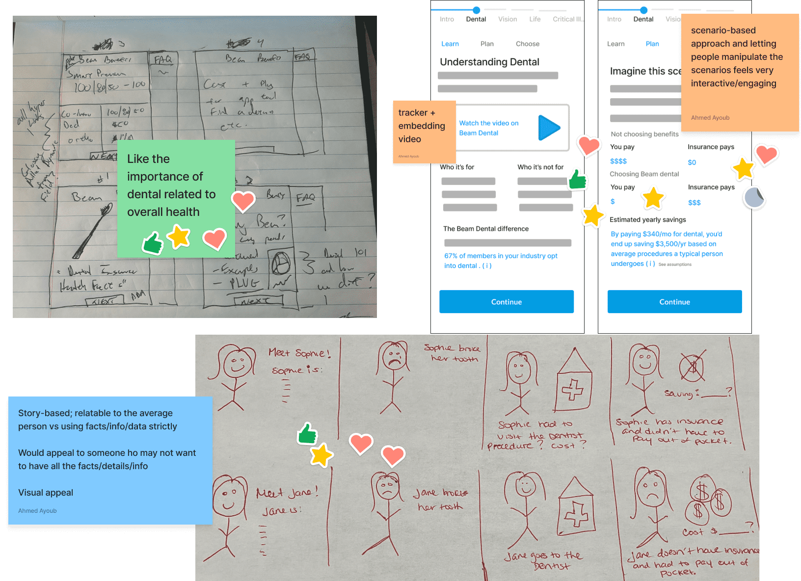
(2/4) Some of the teams' storyboard ideas
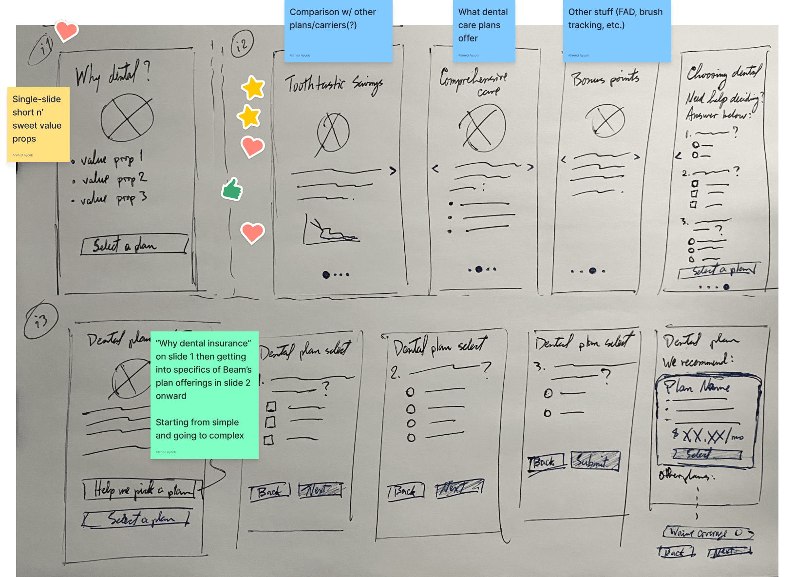
(3/4) I considered 3 approaches for this phase
(4/4) Project stakeholders and I all agreed that info should be conveyed in 3 slides for most insurance lines
Now, why a carousel? We considered it the best approach to ensure brevity and clarity without using much digital real estate, especially when considering smaller devices. If we can communicate the value of each line with little real estate, scaling to larger screen sizes will be much easier.
I wanted to ensure everything fits without needing to vertically scroll. If we can communicate the value of each line with little real estate, scaling to larger screen sizes will be much easier. I opted for the most consistent possible carousel UI design to match phase 1's design direction where it made sense (e.g. headers, buttons).
I strongly advocated for content to follow a 'here's why you need this, with an example of how it works' tone. Understanding insurance is scary enough as it is, more so with the 'you should buy this (with an implied “or else”)' approach. Even without a dedicated content designer, as a writer (by hobby) I know the power of tone and voice. I led iterative efforts to ensure the language matched the vision. The best way to get there was, of course, to test, refine with the guidance of our compliance and insurance product teams, re-test, and refine some more!
Much discussion and debate for each of the 6 insurance lines and starting/ending screens, in FigJam
Beyond the carousels, it was important to set expectations about what BeamElect is, what employees will expect to gain, and what they will do. The end-to-end experience needed to feel digestible, knowledgeable, and inviting. If BeamElect didn't know how to talk about what it offers, how could we expect anyone to buy into those offerings?
Engineering started building out phase 1 designs, and the content for phase 2 was set. Now to tie the vision together into a single unified mobile design flow (and desktop screens so the development team has reference points for scaling). For accessibility purposes, I moved away from our brand's lighter blue to navy in the final designs.
Thus, BeamElect was born...
You can also click through the prototype if you prefer to be more hands-on.
...and among the businesses that tried it, including Beam itself, during open enrollment periods (or qualifying events, such as new hires), the numbers spoke for themselves:
Overall user experience rating upon completing enrollment via BeamElect
said insurance information was 'easy' or 'very easy' to understand
Desktop (60%)
Mobile (40%)
| Insurance Line | Enrollment % Change |
|---|---|
| Hospital indemnity | +10% |
| Supplemental life | +29% |
| Accident | +18% |
| Critical illness | 16% |
BeamElect's successful launch and reception answered the problem we set out to solve in the first place, and it would only improve over time.
To build off of BeamElect's success for open enrollment season 2024, we scoped in time to explore and build more insurance product offerings into the experience:
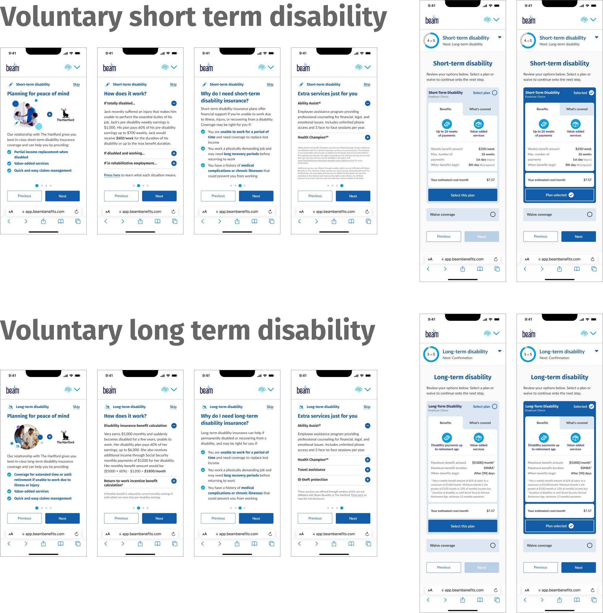
Implementing disability insurance options was also a business need at the time as part of Beam's partnership with The Hartford, so the timing was serendipitous . As with the current BeamElect experience, both disability insurance lines needed their respective sets of plan cards, carousels, and plan selection screens.
I recycled the UI for these elements, and the plan card information would be built off the benefit summaries from the backend. Fortunately, both products were similar enough that designing carousel content for one meant designing most of the content for the other.
For medical plan selection design, I needed only to focus on restructuring the plan cards to accommodate for medical plan information. This is because the planned backend work would need to read medical plan documents, which are fundamentally different than all of the other plan documents Beam handles.
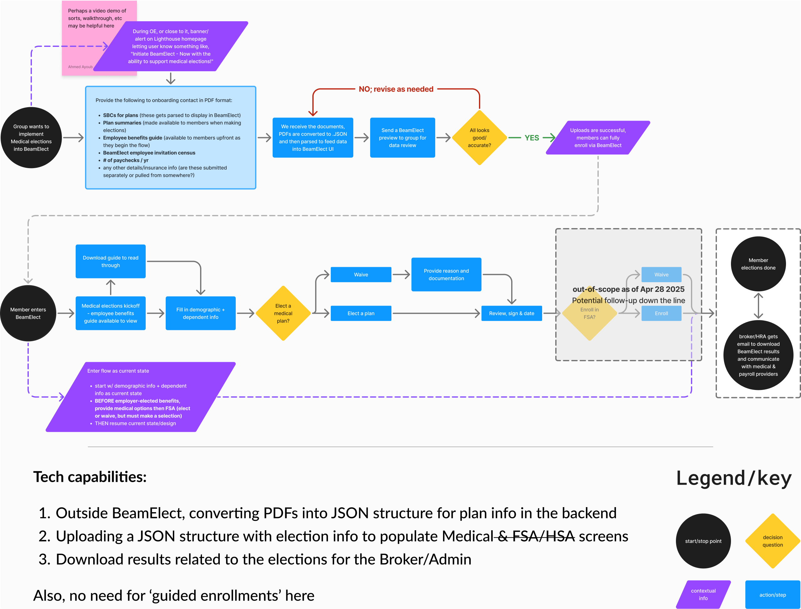
Flow ideation for medical plan integration(s) into BeamElect. Press image to enlarge.
Essentially, businesses would provide Beam with their medical plan documents. Next, we would convert these documents in the backend to .JSON files (for easier data transfer) and work with them to confirm all data appears accurate. Then, that data would be fed into the organization's BeamElect process, after which employees can enroll in all available benefit lines.
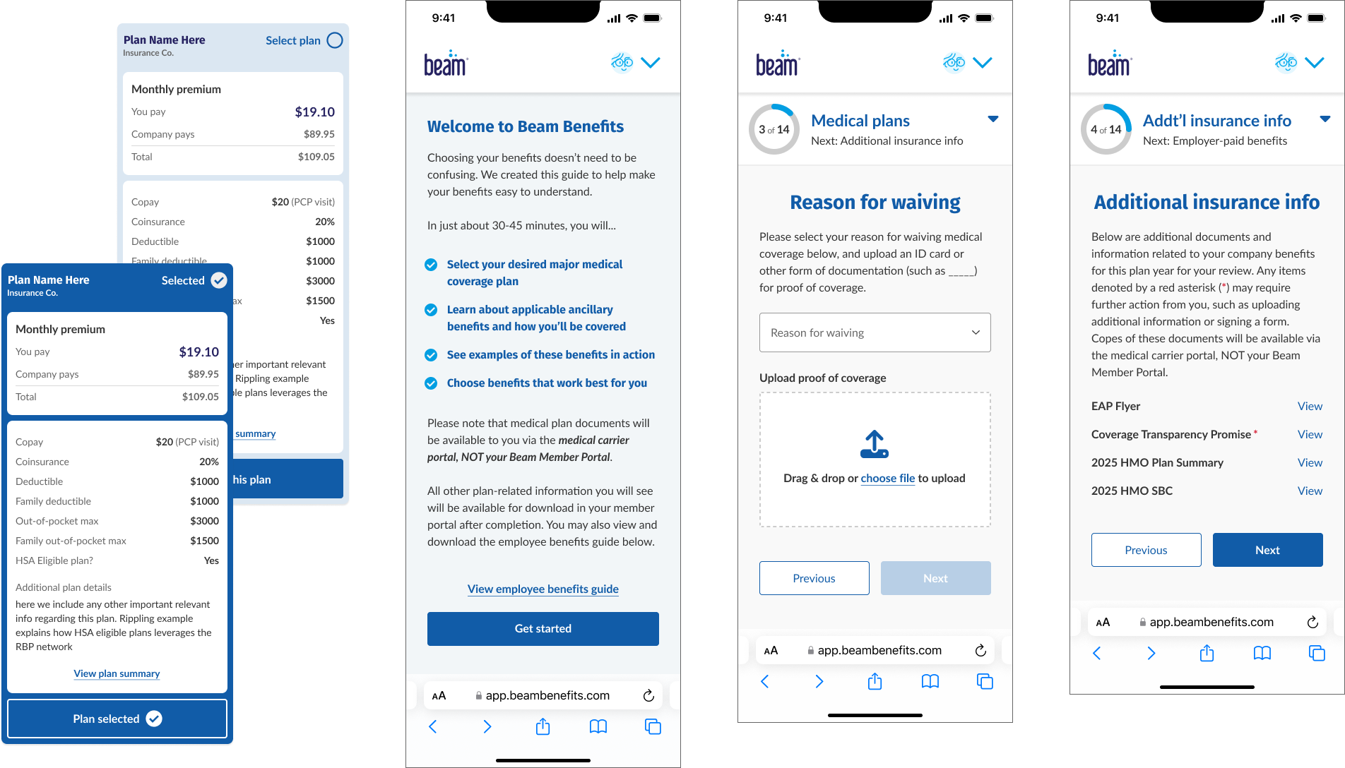
Sample screen and plan card concepts for medical plan selection within BeamElect
As of summer 2025, the medical plan addition to BeamElect was deprioritized due to other more time-sensitive initiatives. Still, this direction will take BeamElect one step closer to being a true one-stop-shop for smaller businesses to enroll their employees in insurance benefits.
UX design | UI design | Research
Redesigning Beam's dental search experience to improve
in-network utilization and reduce costs.